A nostalgic farewell to Directions Magazine

Back when I started my formal career in the geospatial sciences in the late 1990s, I remember learning about Directions Magazine as THE place where I could go for comprehensive, trustworthy, forward-looking stories and news. They were an insight into the geospatial industry that was otherwise opaque in my small academic enclave. Contributing writers and editors Joe Francica and Adena Schutzberg were two of my early GIS gurus, the knowledgeable adults in my novice GIS world. Eventually I too regularly contributed articles, more lighthearted commentary than then industry-informed thought-leadership of the previous years, but it was always a pleasure to share with the broader community.

Change happens, and Directions is shutting down its press after 26 years. Thank you to Jane Elliott for her caring leadership of this valuable resource for many years, to Barbaree Duke for her capable and steady support, and to Rebeckah Flowers for her reliable suggestions and edits that always improved my writing. I’ve now imported into my blog here my digital artifacts originally published at Directions, most dating from 2015 to 2019.

the only constant is change

Gone are the days when I used this blog on a frequent basis to share resources, ideas, announcements. It’s left my workflow, though I’m writing as much as ever. More Slack and text messages than in years past. An example of one other professional change.

Last year I turned over the administrative and business reigns of UCGIS to another professional, and slipped into the role of Senior Research Fellow instead. Still cats to herd, still deadlines, still expectations, but a responsibility of a different type. So far so good. Meetings with I-GUIDE Teams take up the bulk of the hours and the most satisfying ones are focused on the GIS&T Body of Knowledge, for which I still serve as Project Manager. Maybe in 2022 we’ll actually finally migrate off of Drupal and in to our own instance of The Living Textbook. That’s a hope.

Earlier today I listened to the most recent episode of the Quitted podcast, in which Holly Whittaker describes the liminal space in which she finds herself: having quit (or having been removed from) something (again) and not yet started something new. I’ve now listened several times to the last 15 minutes of the episode. The bits that are most powerfully resonant for me are about the reluctance to disappoint people whom you think are counting on you, and the metaphor of having your body responding viciously when you allow yourself to be sucked back into something that your gut absolutely knows it must leave. Plus the overall point that it’s all about identity. How you respond when someone asks what you do. What is our purpose? Our purpose as human beings is just to be human beings. Super important wisdom that I need to be reminded about, again and again, as I weigh the next round of changes.

Is the debate over the ethical use of geospatial data dead?

I was watching the third episode of Penn State’s fascinating series, Geospatial Revolution, this week when I was so struck by a comment that I had to rewind, and rewind again, to jot it down. The speaker was Jeff Jonas of the U.S. Geospatial Intelligence Foundation, who said, “I think that a surveillance society is not only inevitable and irreversible, I have come to this conclusion that it’s irresistible. And it is not governments doing it to us, it’s us doing it to ourselves … The more data that’s available out there the more transparent the world becomes, and the question is, how do people feel about that?”

Hmmmm… How do people feel about that?

Once a hotly debated topic in geospatial intelligence circles, the debate over privacy and other sticky ethics concerns associated with advanced geotracking and location intelligence has all but disappeared from public discourse. A quick online search yields article and forum results from more than a decade ago, with scant recent results.

Are we to believe that the ethical use of geospatial data has been adequately addressed with recent privacy and data management laws, or have we simply given up the debate?

Geospatial industry giants like GISCI and URISA still include a code of ethics on their websites, as does UNICEF. Our own GeoInspirations columnist, Dr. Joseph Kerski, also endorsed an ethical code in his contribution to Spatial Reserves. But when was the last time you actually considered the ethics of your position?

Looking through the GISCI/URISA code of ethics, I’m struck by how difficult part four is in practice today. It reads:

IV.   Obligations to Individuals in Society

The GIS professional recognizes the impact of his or her work on individual people and will strive to avoid harm to them. Therefore, the GIS professional will:

1.   Respect Privacy

  • Protect individual privacy, especially about sensitive information.
  • Be especially careful with new information discovered about an individual through GIS-based manipulations (such as geocoding) or the combination of two or more databases.

2.   Respect Individuals

  • Encourage individual autonomy. For example, allow individuals to withhold consent from being added to a database, correct information about themselves in a database, and remove themselves from a database.
  • Avoid undue intrusions into the lives of individuals.
  • Be truthful when disclosing information about an individual.
  • Treat all individuals equally, without regard to race, gender, or other personal characteristic not related to the task at hand.

How do we apply this to real life situations that we are likely to encounter on the job? And are you prepared to push back on what you believe to be an unethical request?

You haven’t encountered an ethical dilemma on the job? If you haven’t yet, the day will most likely come, as it did for the SeaTac GIS coordinator in 2015 who was asked by the interim city manager to provide household and neighborhood data for the local Sunni and Shiite Muslim population. Among the project goals was to identify the location of “Americans who had not adopted American ways.” The coordinator, uncomfortable with the request, enlisted the support of the city attorney as well as other city staff to push back, and ultimately did not provide the information. Can you think of times when an “unreasonable” request may seem reasonable, or the lines gray and blur? Do you know what you would have done in her shoes?

Penn State has an archive of thought-provoking, true-to-life case studies to get us thinking about our responses and responsibilities, created as part of the GIS Professional Ethics Project. Each study presents a dilemma and requires that you reason your way through to what you perceive to be an ethical response. A seven-step reasoning process taken from “Ethics and the University” is included to help. Read a few studies and ask yourself how you might apply the seven-step process to come up with an adequate response. Ask a colleague how they would respond. You might find yourself in a lively debate.

While there is room for disagreement, we must agree there is no room for complacency. GIS and geospatial technologies have great power to influence society – from determining who gets scarce resources, to who gets bombed in the next geopolitical conflict. With such great power comes great responsibility. Diana Sinton shared some wonderful insights on how we discuss ethics to impact our professional environments in What Makes ‘Do No Harm’ Extra Difficult in the Geospatial World Today? What do others have to say about ethical concerns? A few years ago, DirectionsMag hosted a webinar on the ethics that may offer insights as well.

Prepare yourself by reviewing case studies and engaging in discussion with colleagues and employers. Stay ahead of the latest ethical challenges by regularly stopping by our Ethics topic page, and reviewing the efforts by geospatial technology providers to address privacy and other concerns, as Esri has done with its Geospatial Virtual Data Enclave.

What effort can you make within your own environment, today, to safeguard the ethical use of the geospatial data to which you have access?

Reposted from The DirectionsMag Geospatial Community Blog, an extension of Directions Magazine. Visit us for daily geospatial news, exclusive articles, geospatial webinars, and podcasts. If you are interested in contributing, please email editors@directionsmag.com.  

https://www.linkedin.com/pulse/debate-over-ethical-use-geospatial-data-dead-rebeckah-flowers/

The Census Data Has Arrived. Here’s What You Need to Know.

The geospatial community has been talking about the 2020 Census since 2011. Who knew that a pandemic would steal the spotlight?! But at the same time that the pandemic was taking attention away from the census, it was creating an unprecedented, worldwide need to understand population density and mobility. 

“While those of us in geography and GIS have long used census data, … some people outside of geography are surprised that geographers have been a fundamental part of census operations for decades,” Dr. Joseph Kerski commented in his interview with GeoInspiration, Jim Castagneri

Indeed, the geospatial community uses these data as a touchstone for all kinds of projects, but how much do you really know about the census

Are you aware that the data is free? Despite the pandemic, the 2020 U.S. Census still happened, with the data coming in phases as expected; the 2020 Census Apportionment Results were released just weeks ago. Older data and tools, like the Business Builder, are available now. If you need training, the Census Virtual Academy is available to sharpen your skills. 

Do you know what changes with this new data? In 2017, we learned of sweeping design changes, and in a March 2020 podcast, we discussed what comes next for GIS professionals

All areas of our everyday lives are affected by this data and how it’s analyzed–everything from modeling disease to the distribution of political power. Dr. Diana Sinton wrote about what’s involved with redistricting in 2019, and a recent webinar demonstrated an easy tool to provide transparency into this critical process. Recently released maps from Esri highlight 2020 Population Change and Seats Gained/Lost and visualize Change in Resident Population Compared to National Change, 2010 to 2020. Click any state to see how they fared over the decade. 

Take the time to dig into these resources, learn more about the census, and consider how population changes will influence your life and work in the coming years.

Image

Esri’s Change in Resident Population Compared to National Change, 2010 to 2020 map reflects the latest census data.

Reposted from The DirectionsMag Geospatial Community Blog, an extension of Directions Magazine. Visit us for daily geospatial news, exclusive articles, geospatial webinars, and podcasts. If you are interested in contributing, please email editors@directionsmag.com.  

https://www.linkedin.com/pulse/census-data-has-arrived-heres-what-you-need-know-directionsmag-blog/ 

Yes, You need Python Skills. Here’s How to Get Them.

After DirectionMag hosted Esri’s free webinar, ArcGIS Notebooks – Using GIS and Python Notebooks for Workflow Automation last year, a number of attendees followed up with us, many admitting that they lacked the skills to do the kind of work presented. Some wondered whether it is really important to have programming skills in today’s GIS environment; others wondered how they could get the skills they needed quickly and inexpensively. In today’s post, I want to address both of these questions.

How important are programming skills in today’s GIS environment?

The answer depends on how badly you want the job.

 “…the skills set of programming together with a capacity to problem-solve is a particularly powerful and pertinent combination for those eager to procure—and maintain—GIS employment.”

—Diana Sinton, “GIS Jobs of Today: How does ‘Open’ Fit into The Mix?,” 2016

 Over four years ago, Diana Sinton, DirectionsMag columnist and the executive director of the University Consortium for Geographic Information Science, wrote a series of columns on the requirements of GIS jobs. Even then, there was consensus on the importance of programming skills. 

 “Without a doubt, GIS professional with Python and other programming language skills will get the best positions. Those with programming expertise garner higher salaries and are more valuable to employers.”

—John Gabriel, co-owner of Alsea Geospatial Inc., from “GIS Jobs of Today: Should you have programming skills?” by Diana Sinton, 2016.

Taking a quick look through the GIS job ads in 2021, there is little doubt that programming is highly valued by hiring managers. So, the question isn’t if you need the skills, but rather, why have you hestitated?

Python was chosen by Esri for ArcGIS specifically because it is easy to learn, while also being scalable and complex enough for experts. There are literally hundreds of online resources for learning it, so there is no more room for excuses. It’s time to get to work!

 How can I learn Python as quickly and inexpensively as possible?

There are two schools of thought on this one:

1. You can learn Python within the context of ArcGIS, and rely heavily on Esri tutorials, or

2. You can learn open-source Python coding, then tweak your knowledge to use Python within ArcGIS.

  If ArcGIS is your primary concern, a good place to start is with Esri’s free, interactive webcourse, “Python for Everyone.” The course takes about 3 hours to complete.

Then hop back into LinkedIn and sign up for Jennifer Harrison’s 2.5 hour course, Learning ArcGIS Python Scripting.

These courses, along with a copy of the book, “Python Scripting for ArcGIS Pro” by Paul A. Zandbergen, will give you a solid foundation of skills. (DirectionsMag ran a review of the first edition of this book in 2013. To get an idea of how effective the book will be, you may be interested in reading the reviews before picking up a copy.)

Finally, reinforce your skills and get a look at their larger context, with Penn State’s Geog 485: GIS Programming and Software Development course.

 If you’d rather learn Python generally, and dive into ArcGIS later, take a look at Google’s Python Class, UDACITY’s Introduction to Python, and this free online tutorial from the University of Chicago to get your feet wet.

With the basics behind you, consider moving into some of the low-cost training courses available from online academies; Penn State’s Geog course material recommends the beginner-friendly courses offered by codeacademy.

If you are still looking for more, the wiki “Python for Non-Programmers” provides a huge list of resources to explore.

After working your way through these resources, you’ll be feeling pretty comfortable with Python, but heed this word of warning. Head over to DirectionsMag for this quick read before you dive into ArcGIS: “10 Common Python Errors of Beginning ArcGIS Programmers.

You’ll be more than ready for our next Python-related webinar!

Reposted from The DirectionsMag Geospatial Community Blog, an extension of Directions Magazine. Visit us for daily geospatial news, exclusive articles, geospatial webinars, and podcasts. If you are interested in contributing, please email editors@directionsmag.com.  https://www.linkedin.com/pulse/yes-you-need-python-skills-heres-how-get-them-rebeckah-flowers/

Global Conversations around GIS and Education

Tomorrow we’ll host the 2nd in the Americas’ series of panel discussions around what it means to be a resilient educator of GIS and GIScience, and what it means to implement technologies in support of that outcome. The Europe/Africa one has already taken place, the Asia-Pacific one yet to come. Info about these can be found here: https://www.globalgiscienceeducation.org/, and I encourage people to join, listen, share.

COVID has been a disruptive factor, obviously, but these conversations have uprooted much more that has been problematic for years. Too much expected of too few, too little capacity to connect dots. Why every summer do we keep wondering what textbook to adopt when only a fraction of students buy or read the book? Shouldn’t we be doing something a little differently? A lot differently?

a GIS kind of week

A friend from work asked me today if I quilted and from there it became an opportunity to upload some new quilt pictures, then it became pretty clear that I hadn’t actually posted anything new in a very long time.

We all know what kind of crazy it’s been this COVID-year so no need to go there. So I’ll just talk about the last five days: compiling these GIScience/GIS instructional resources, getting news that the article I wrote with Tom Wikle about GIS Certificate programs was now out in Transactions in GIS, wrestling with the new server that hosts the GIS&T Body of Knowledge and chatting with colleagues about its future platform, making more plans for the global Resiliency in GIScience Education panels that are taking place, and writing letters of support for in-going proposal to do great things with GIS & GIScience.

I’m now starting to update my own upcoming fall 2020 class at Cornell (Intro to Mapping & Spatial Analysis with GIS) to use QGIS instead of my usual ArcGIS Pro. Why? The labs, which will have maybe 20% of the students in-person, at least that’s the plan today. Most are Mac-users, living and learning who-knows-where in these times, and most of the class will be online and otherwise suffering through small-laptop-screen-itis via the painful clumsiness of AppsOnDemand, plus its awkward data saving manipulations. Just can’t do it. Way too many other stressful factors in the world today to not simplify this one thing, for at least this one semester. And this way I also get to work more with Keith Jenkins, our very own QGIS superstar support colleague, who was super busy last month with the QGIS North America conference. Yay for Keith.

Dust Off Your Bookshelf and Escape with an Atlas

THUMP! goes “The Complete Earth” on my sofa. Wife Wendy is displeased because that’s her reading spot, but I’ll need a lot of space, since I have other maps and atlases deployed. Some are for boredom relief, others are relevant to our current crisis, and others are for our upcoming adventure into the Big Empty.

Even if the libraries and bookstores are closed, we have bookshelves. I’ve been going through mine and finding treasures. I’d planned to give a basic top 10 list of my favorite atlases, but as I began, I realized that would be impossible. How do you choose your favorites if you have over 100? Instead, I’ll explore how atlases enlighten us in ways that other media cannot.

 Atlas was the Titan of Greek mythology who carried the world on his shoulders. That would be 13 billion trillion tons. It isn’t the weight of the Earth, but “The Complete Earth” is hefty, offering hundreds of full-color satellite images of our beautiful home at multiple scales and multiple times.

Atlases take time to absorb. We get drawn into every page. We don’t just type in a place name and zoom in, we have to find it in the book. When we do, we see everything around that place as well. As I said in a previous article, paper maps aren’t keyholes. We zoom in with our brains and eyes, not our screens.

We’re not flying right now…

However, we can still see the Earth from above. Like “The Complete Earth,” Yann Arthus-Bertrand et. al’s “Earth From Above” is a massive book, with fold-out pages that display ancient history, natural wonders, and everyday life around the globe.

Bernhard Edmaier’s “Patterns of the Earth” isn’t quite pocket-sized, but carriable. As much art as geography, it is organized thematically, with sections titled “Bands,” “Spots,” “Webs,” “Swirls” and “Spikes,” among many others, illustrating how the Earth itself is a work of art.

To Mamie, from Rewie

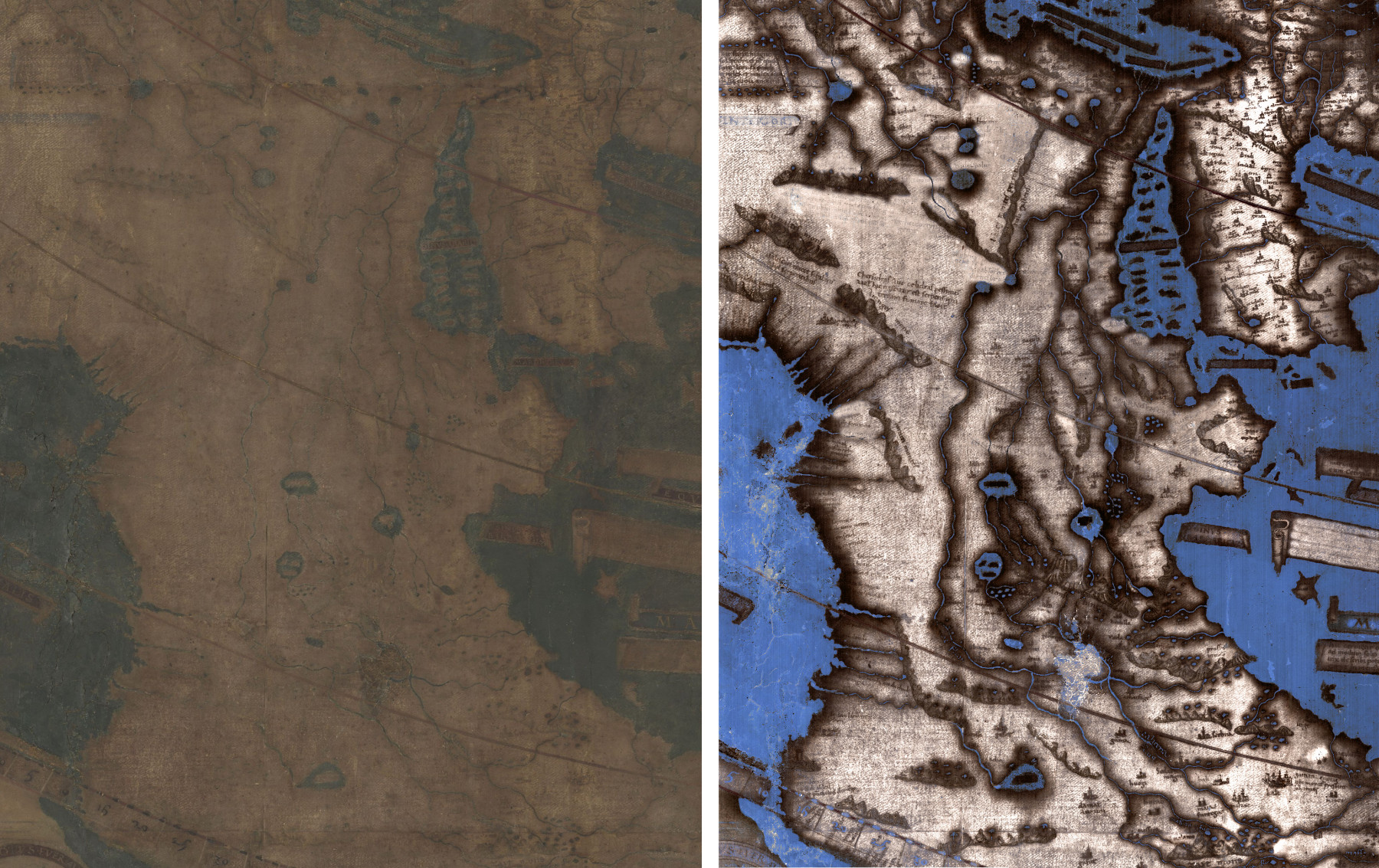
That is the handwritten inscription in my most treasured atlas, a ragged “1942 Rand McNally Ready-Reference ATLAS of the World.” More than an atlas, it is a picture of a young lady’s life during and after wartime. Inside the front cover is a pencil list of AM radio stations and ink doodles of butterflies. On nearly every page are handwritten notes, with battle sites in Europe and the Pacific circled and dated.

Another of her notes in Arizona, “double plane crash, June 30, 1956,” indicates this atlas had been in her hands for at least 14 years. That incident was the impetus for the creation of the FAA. Mamie’s atlas was a diary, a textbook, a sketchpad, and her connection with the greater world during a time of isolation.

Atlases have been read and touched.

Several years ago, I had the privilege to visit the workshop of Raven Maps and Images and Allan Cartography in Medford, Oregon. We’ve all seen their beautiful wall maps of states and countries. Stuart Allan was heading for retirement, so they were downsizing and trying to empty the office.

They generously offered me their surplus, so I took as many atlases as I could carry down the stairs. It was a fascinating glimpse into the perspective of one of our most influential modern cartographers, and a reminder that all the work we do as geographers is always based on our cartographic forbears.

In 1994, archaeology wasn’t for me anymore, so what to do? I found geography when I bought a used 18th edition “Goode’s World Atlas.” It displayed data in a way that I’d never seen, making me realize how maps reveal the world. If I could make good maps, I might be able to change the world for the better. I have used newer versions as textbooks in many courses, but Number 18, you’re always in my heart.

“It’s like an explosion in your brain.”

So says Simon, the London taxi driver. Diana Sinton and others have discussed the difference between real-time navigation and mental maps. I’ll never be as smart as a London taxi driver, but I need a journey right now after so much isolation.

The Big Empty is the vast, beautiful corner of California, Oregon and Nevada, far too big to fit on a phone. I have to get the paper out! It begins as a mess of maps, atlases and pens. Reckless as I am, I don’t want to pull out maps and atlases while I’m driving, so I need a good mental map.

As I explore these different maps, each of which reveal the same places at different scales and tell different stories, I develop a geographic perspective that scales down to smaller pictures. Just turn left at the windmill.

“Who controls the past controls the future. Who controls the present controls the past.”

That dark quote is from George Orwell’s dystopian novel “1984,” in which history is revised on a daily basis. Geography doesn’t just reveal space, it reveals changes over time. Using a map app, we see the world in that moment only. Geographic reality can be changed by parties unknown.

My oldest atlas is from 1909, a geography textbook. There was no Panama Canal. Before air travel, the immense island of New Guinea was unexplored and unmapped. Neither world war had happened, but there were portents. Then “Goode’s World Atlas” from 1946 shows the geopolitics of the world just after one of the most significant events in modern history. A stack of atlases, cumbersome as they may be, tells stories through time.

Fifty Islands I Have Never Set Foot On And Never Will.”

That is the subtitle of Judith Schalansky’s “Atlas of Remote Islands.” As we shelter in place, we realize that we’ll never see every place on Earth. Yet every map of every place can tell a unique story of a unique place and take us there. In “Another America: Native American Maps and the History of Our Land,” Mark Warhus shows us familiar places mapped from a very different perspective, some on paper, some on bison hides.

William Hornaday shocked Americans with his depiction of the rapid decline of the bison after the Civil War, which helped spur the modern conservation ethic. Included in Susan Schulten’s “A History of America in 100 Maps,” it is one of 99 others that illustrate how history is written in maps, and also how maps can write history.

Every atlas offers a different perspective. “Brilliant Maps: An Atlas for Curious Minds“, “The Penguin State of the World Atlas,” and “Atlas of the Real World” blend cartography and infographics. The latter, for example, uses cartograms to distort the land areas of the world based on thematic data such as electricity access and spending on tourism.

THUMP! goes the atlas in the classroom!

Seminal in map-based infographics are the works of Edward Tufte. After attending one of his trainings, in which his three books were the primary curriculum, I used this same technique teaching an archaeology course. Tufte’s books are based on page pairs, with two facing pages each delivering a lesson.

Instead of a textbook, I taught from “Past Worlds: Collins Atlas of Archaeology.” Students laid out their books (THUMP!) as we discussed topics on specific pages. Page pairs made teaching from an atlas not only effective, but far more engaging than slides on a screen. These were their own books—they could make notes, draw on them, doodle like Mamie. When they left, the book was theirs to keep.

The third-grade class at Sage School will also have their book to keep. They wrote “The Klamath Agency: Stories of the Past,” interviewing Klamath tribal elders and making a map that reconstructed the Agency as it was in the 1940s. Most of the buildings they mapped are gone, but they created a record of the past that can be passed on to the future. Years later, these kids can pull their work off the bookshelf. Stories told by elders long passed will still be in their hands.

Image

I could go on and on, page by page

Obviously, I love atlases. Every individual copy has a story, but not just the information it offers. This one led me to my wife, this one changed a kid’s life, I helped edit this one, I bonded with a colleague looking at this one…

Books offer a sense of permanency. They can smell fresh-off-the-press or they can smell like generations of readers before us. The pages may sound crisp and new or they may sound dangerously close to turning to dust. Like Mamie’s 1942 atlas, maps, books and atlases connect us with the greater world.

Whether you’re exploring map treasures virtually or have the honor of owning a few collections, take this strange time to go exploring from your sofa. With an atlas, you can relive past adventures and plan new ones, visit places you’ll never go, and explore the same world from vastly different perspectives. 

The Role and Future of Spatial Data Infrastructure: an interview with Esri's Dr. Jill Saligoe-Simmel

Directions Magazine’s Diana Sinton sat down with Dr. Jill Saligoe-Simmel, the product manager of SDI and INSPIRE for Esri, to discuss the increasingly clear role that spatial data infrastructure plays in problem-solving.

Diana Sinton: Your position at Esri is a new one. What has been driving the increased interest in, and awareness of, spatial data infrastructures?

Dr. Saligoe-Simmel: Whether it’s called an NSDI, OneMap, Regional Information System, GeoPortal (as in Africa GeoPortal), or otherwise, spatial data infrastructures (SDIs) continue to be relevant and pervasive at all levels of government and across many sectors. At their finest, they enable cross-border and multi-organizational collaboration to address our most significant social and environmental challenges, including natural and human-made disasters. These collaborations promote efficiency at all levels of government.

In the past, metadata catalogs and data exchange dominated SDI initiatives, often with a “build it and they will come” approach. Over the years, with a few notable exceptions, many SDIs have struggled to gain traction. Yet the overall objectives of SDI are quite sound, and may be more relevant than ever. That’s why I’m optimistic about seeing new patterns emerging that expand the focus of SDI on problem-solving.

Today, SDIs are rapidly evolving. Together, the internet and cloud computing are transforming the way organizations manage data and collaborate. Web GIS is significantly easier to use, deploy, and integrate into an SDI ecosystem than traditional systems. For example, portals manage all aspects of geographic information, including data and services, maps, analytical models, applications, workflows, and even data security and access. Organizations are connected through a network of portals. Data service APIs enable users to bring together data dynamically from distributed systems into a host of applications.

Through this emerging geospatial infrastructure, users can now inexpensively and efficiently access immense amounts of geographic data. Community members can easily share maps, analytical models, applications, and workflows across and among multiple users and organizations. The result is a secure but highly collaborative environment — an integrated set of deployments focused on shared goals.

For over 30 years, Esri has promoted and supported SDIs at local, state, regional, national, and global scales. We have deep experience in SDI, interoperability, and open standards. It’s an opportune time to make sure we are supporting SDI success in this new era of geospatial infrastructure.

Diana Sinton: Now that you’ve settled into this new position, towards what types of goals are you working? What is a typical day for you? 

Dr. Saligoe-Simmel: As a product manager, I focus on identifying and communicating SDI-related patterns and practices, and how we can best support them with our underlying platform. While listening to our customers and the market, I also collect, quantify, and prioritize common problems where we can help evolving SDI to be more successful. Each day, I spend time listening to and observing the SDI marketplace and thinking strategically about how we can further our customer’s success. By understanding our customers’ experiences, we can identify common patterns among successful SDI and share those patterns and practices with others.

In her book, Governing the Commons (1990), Elinore Ostrom recognizes that “common pool resources” operate under diverse institutional arrangements. This certainly applies to SDIs, where there isn’t a singular organizational model for success. Cooperation can take many forms, and common patterns emerge — for example, a meaningful pattern is: Framework data are open and clearly identified as authoritative. When users find themselves awash in a sea of data, the open data movement is a victim of its success. Are the data the best available? Are they sourced from the local authority? Authoritative data provide a single point of reference for all parties to work from — a common operating picture — that is critical to effective government operations.

NC OneMap is an authoritative discovery point of geospatial data for the state comprised of data supplied by multiple agencies. Therefore, it was important for them to establish a set of standards for documenting resources so that authoritative data providers do it consistently and in a standardized fashion. This way, when someone performs a search, they can be assured that results list all the relevant resources. NC OneMap shares its best practices for sharing authoritative data on their Open Data site. 

The need to manage authoritative data effectively will grow in importance as open data policies, such as the U.S. OPEN Government Data Act and the EU Open Data Directive, are enacted.

Diana Sinton: The more front-facing piece of spatial decision infrastructure is readily accessible data, but much has to happen for that to happen effectively and efficiently. Do you have any examples or stories about those essential, but less visible, parts of SDI (problem-solving, reducing duplication and effort, etc.)?

Dr. Saligoe-Simmel: The most significant challenges for most SDI remain policy and organizational, not technology. Though SDI communities have laid the groundwork for governance and policies, there is still much to be done.

For example, SDI’s have traditionally focused on the roles and responsibilities of their coordinating bodies and contributing partners. Over the last several years, we observe that the most successful SDIs are often mission-focused – sometimes encompassing the missions of multiple stakeholders. Communities of practice can amplify the value of their SDI by designing for end-use by the consumers (who are sometimes, also, partners).

Around the world, people and organizations aspire to be safe, healthy, prosperous, and more. These aspirations can be translated into initiatives that citizens understand and support. The use-cases (or value proposition) drive the SDI data. In a 2014 Report of Stakeholder Engagement on Four Geospatial Issues with National Importance, National States Geographic Information Council (NSGIC) members recognized that mission-specific programs are typically successful, although not always in a way that meets the needs of the entire geospatial community. It remains that the positive impacts of mission-specific projects should shape our SDI thinking as we move forward.

A great example is Open Data DC, which shares hundreds of datasets freely among agencies, federal and regional governments, and with the public. What’s innovative is how they wrap their open data site in apps and data stories, such as preserving tree canopy and recycling, that engage their stakeholders and the public. Initiatives can also be a mechanism that facilitates framework data. For example, Addressing In DC shares information on the history and standards behind their comprehensive Master Address Repository (MAR) and provides educational information to guide people to use the data, apps, and map service APIs.

At a national level, HIFLD Open Data provides access to hundreds of national foundation-level geospatial data within the open public domain for use by local, state, federal, tribal, private sector, and community partners for community preparedness, resiliency, research, and more. It demonstrates a distributed portal model in action. In 2017, the U.S. Department of Homeland Security (DHS) launched dedicated websites to unify the response and recovery data aggregation efforts for hurricanes Harvey and Irma. Built on top of the HIFLD Open Data portal, these sites provided event-specific hubs to disseminate data and support the massive mapping activities for response and recovery.

Globally, we see similar patterns with the UN Sustainable Development Goals (SDG) Hub. Beyond data, GIS professionals, developers, and domain experts are collaborating with shared workflows, models, analyses, templates, and code. The next decade should prove an exciting time for SDIs, enabled by open platforms and the geospatial cloud.

New Ways to Use Old Maps

Digital technologies have inspired and launched revolutions within the field of cartography in the recent past, bringing mobile mapmaking to our finger tips. Cartographers with an eye to the historic aesthetic are pursuing approaches to make new maps look old. But what about new ways to look at old maps? How are modern technologies being used to support research and investigations?

One way to appreciate historic cartographic treasures is to gift yourself new lenses with which to look. The Beinecke Library at Yale University has facilitated this process with the 1491 Martellus map in its collections. Produced by Henricus Martellus in the late 15th century during the epoch of global explorations, contemporary scholars have long wondered about the knowledge that the cartographer included in his production. Unfortunately, the map’s faded and deteriorated condition has greatly obscured almost all of its text, at least to the naked eye. What is there that we just can’t see anymore? 

That’s the type of question that fuels The Lazarus Project, a research endeavor now based at the University of Rochester and directed by Gregory Heyworth. By using camera sensors that can capture light from wave lengths both smaller (ultraviolet) and larger (infrared) than the human eye can detect, Heyworth and his colleagues combine bands to produce new multispectral images of early manuscripts and other historical documents that allow us to see what had been otherwise obscured for centuries. Cartographic historian Chet Van Duzer oversees the Lazarus missions that deal with maps and globes, and he has worked closely with Roger Easton, an imaging scientist at the Rochester Institute of Technology, to produce the enhanced images of the Martellus Map, with funding from the National Endowment for the Humanities. Remember that children’s story about Harry the Dirty Dog, who refused so stubbornly to take a bath that eventually his family fails to recognize him until after a good scrubbing? Viewing the before-and-after examples of these multispectral images signifies a similarly magical visual transformation. 

Image

 An image of Africa on the Martellus Map as it appears in natural light (left) and an image of the same section that has undergone multispectral image processing (right). (Images by Lazarus Project/MegaVision/RIT/EMEL, courtesy of the Beinecke Rare Book and Manuscript Library.) 

A particularly enticing feature of the Martellus map that was revealed was its descriptive texts. These proved challenging to uncover because Martellus had used different pigments for different texts, the same way we would choose a different color or fonts. Van Duzer recalls how Easton spent months tweaking the combinations of bands iteratively and uniquely to optimize the legibility one section of the map at a time. This labor of love was necessary to achieve the highest clarity and legibility possible, and Van Duzer has detailed his research findings in a new book, Henricus Martellus’s World Map at Yale (c. 1491)

Designing the multispectral camera system to be a mobile and transportable one means that historical objects that would otherwise never travel— such as a 500+ year-old map — can undergo data capture under safely controlled conditions in their home institutions. An even older map on which the Lazarus scholars, particularly Ph.D. candidate Helen Davies, have been working is a 13th century mappamundi in Vercelli, Italy. Previous attempts to clean and restore the map damaged it significantly, but the multispectral techniques are non-invasive and non-destructive. This is the only feasible way to approach such precious and unique items with the aim to generate clear views of the original content.

Image

Gregory Heyworth working in Yale University’s Beinecke Library, with the Martellus map on an easel set in front of the camera. (Image courtesy of Chet Van Duzer.)

Text and images that have been compromised because of fading and material deterioration are one reason for lost research and educational opportunities. Other reasons include restricted access conditions for the protection of the items, or their physical characteristics; massively large maps are difficult or impossible to see in their entirety from one vantage point.

Digital versions address many of these concerns in a way that also enables greater access to the objects themselves. In the world of historical maps, the David Rumsey Collection at Stanford University is legendary. This vast collection of paper maps has been digitally scanned at such a high resolution that extreme viewing of the details is made possible at a greater level than is even possible to the naked eye (especially for those of us with eyesight compromised by age!).

Some of the maps in the Rumsey Collection are difficult to appreciate fully as scanned items, however, not because of their resolution, but because of their great size. For example, in the late 16th century, an Italian nobleman named Urbano Monte became fascinated with the idea of designing and producing a large-format world map in the round, one that would be about 10 feet in diameter when assembled. How was it printed in preparation for this? The individual “tiles” were 60 sheets within a manuscript atlas that could be unbound, cut-out, and edge-matched. His intent by design was that the 60 map sheets would be assembled into a flat circular map that would be backed with wood, then made rotatable about its central point, like a big wagon wheel. It is unknown how many of these Monte maps were actually produced, and it’s unlikely that any were ever assembled as envisioned.

Rumsey owns one of the Monte manuscripts, printed in 1587, and has provided the world with high-resolution versions of its individual sheets. Monte’s beautiful and captivating map has now been re-projected as a globe as one of seven world and celestial maps that are available in an augmented reality format through the AR Globe app (free; currently available only in iOS).  Monte was imagining that a 10-foot diameter wooden disk that rotated would be a fascinating representation to explore the world, but he never had the chance to play with a mobile digital device! Being able to zoom and rotate his map – and the others that the app makes available is an exciting tool for exploration and discovery.

Image

The 1587 Monte world map as a digital globe in virtual space (left) and a zoomed-in section of interest (right). Image source: Diana Sinton.

Not only are these maps aesthetically remarkable, but these digital formats enable unprecedented access for scholars. For example, Van Duzer has been exploring how Monte created his huge map — what sources he used for its geographical contents and images, and what inspired his map’s projection and rotatability. The number of historical maps may be a finite set, but there will increasingly be novel ways to consider these with new approaches and lenses.