Editor’s Note: Happy GIS Day 2018! We’ve all had that GIS career moment when someone needs a “little help” with a map project. Hours turn to days as your “small” project grows beyond your expectation. Enjoy the journey and lessons learned from our own Dr. Diana Sinton as she shares her recent adventure in volunteer cartography.
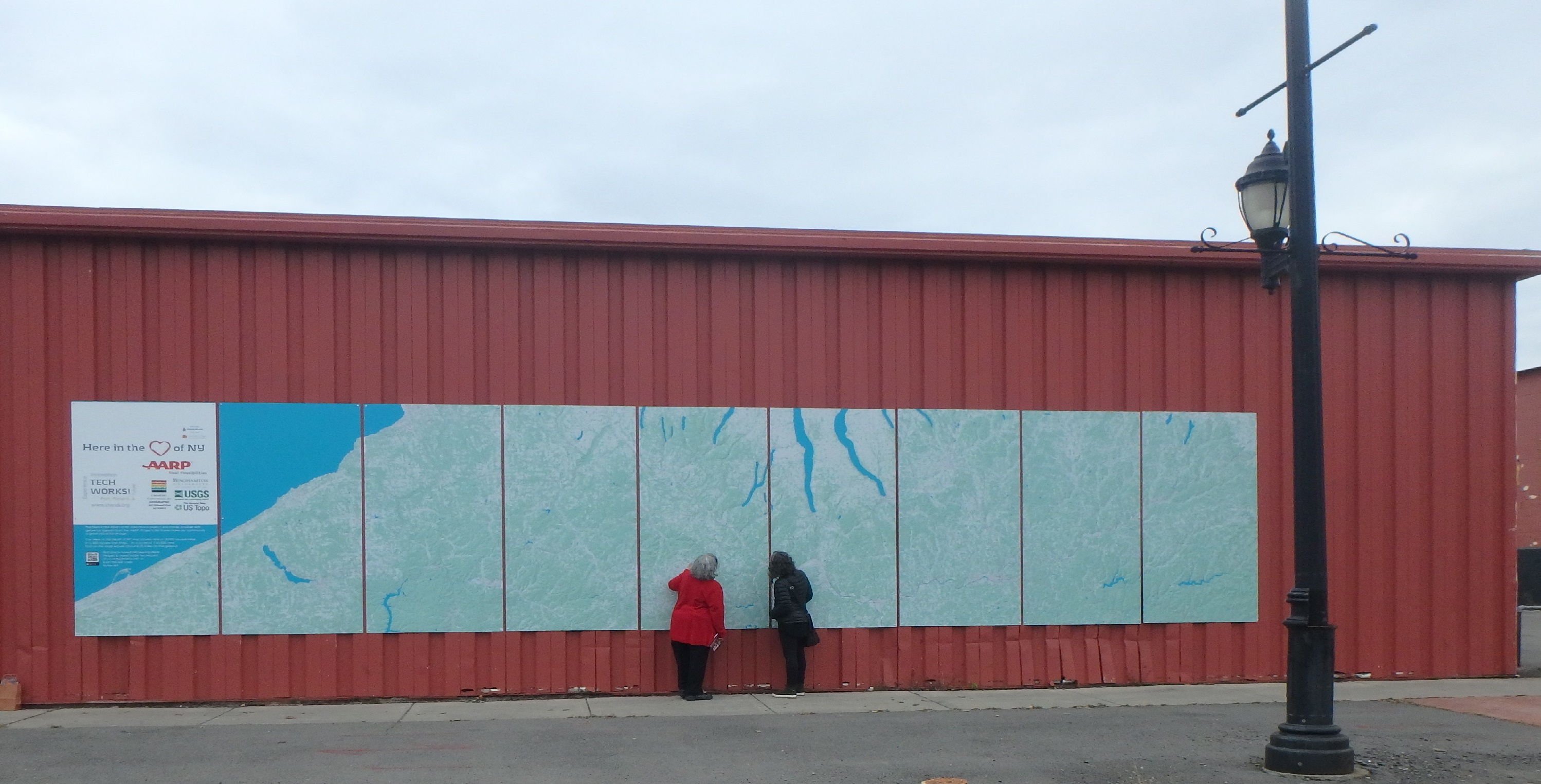
As of November 2018, there’s a new, massive map mural in Binghamton, New York. It was the inspiration of the Center of Technology and Innovation, also known as TechWorks!, a local nonprofit organization whose mission is to document and present in context the inventions and industrial innovations of New York’s Southern Tier. Binghamton and its neighboring cities have a long history of technological innovation, especially in the fields of aviation engineering and manufacturing. For example, the world’s first flight simulator was created in Binghamton and a working version is part of the TechWorks! collection.
TechWorks! was unfamiliar to me until the day in October when I received an email from its executive director, Susan Sherwood, describing this large mapping project they had underway. She’d been given my contact information by a colleague at USGS who knows that I happen to live near Binghamton, and she was wondering if I might be able to offer some “advice, assistance, a Hail Mary perhaps, to figure out the best way to proceed,” as the team had reached an unanticipated technical impasse.
I don’t recall ever actually saying yes to seeing the mapping through to the end. I distinctly remember thinking that perhaps I could troubleshoot problems with the data, then turn everything back over to the others. That would certainly be the best plan of action, I figured, since I’d have been a fool to commit to doing any more than that. (Did I mention that the maps were to be a massive mural, covering over 19,000 square miles of New York and Pennsylvania across nine separate 4-by-8 feet Dibond panels that would be hung onto an outdoor wall of the TechWorks! building? Moreover, to allow time for the printing and installation, Susan estimated we had about ten days before the final digital files had to be turned over to the printer!)
If this story didn’t have a good ending, the disappointment would still be too raw to share it, but miracles do happen and the maps are complete and installed. Many people and institutions came together to make this happen and each played important individual and collaborative roles. On this GIS Day 2018, I’ll share a few of the lessons that I learned through this humbling experience.
Stay Flexible, since Done is Better than Not Done
As far back as 2012, TechWorks! had envisioned the large map mural as a detailed visual display that illustrated the geographical context of the “ideashed” that was the rich, innovative region of New York’s Southern Tier. Students and faculty at SUNY Binghamton had already compiled and georeferenced historical USGS topographic maps of the full area. This would be a community education outcome, of interest to people of all ages. But the scale and resolution of those raster topos was not reproducing well on these large panels. Deciding to shift instead to using current vector data over a shaded relief background meant abandoning the beauty and details of the historical topos and is what triggered this last-minute need for additional GIS work, but it was a sacrifice necessary for the sake of clear resolution and project completion.
The USGS Rocks
Data from The National Map are what populate these maps, and by the time I jumped into this project, other people had already decided what the map extent would be and packaged the downloaded data layers into nine large Esri-ready geodatabases. But what made the final maps possible are not just the data, but also this remarkable USGS collection of technical lessons. Did you know that a template exists that allows you to produce USGS-styled topographic maps directly? I didn’t either. Thank you, USGS, for helping people make maps.
Cartography is Science AND Art
Remember that saying about how your study area will inevitably fall at the intersection of multiple topo quads? Seamless TNM data have moved us beyond the need to mosaic individual quads but we still had to battle with map projections. For this project, Panels 1-5 fall at the western edge of UTM Zone 18N, and Panels 6-9 lie at the eastern side of UTM Zone 17N. No major problem with that, but the span of latitude reminded us that the round Earth and flat Dibond panels needed to be reconciled. Each rectangular panel covered about 66 miles in a north-south direction, from about 41.8˚ to about 42.8˚ north latitude. I wasn’t privy to any of the original data collection or earlier manipulation efforts but it became very apparent very quickly that unless some tweaking was done to the projection parameters, some data would not be orthogonal within their respective rectangles. Installing the panels at an angle or having data gaps at edges was surely not a desirable outcome. Do you spend much time iteratively modifying the central meridians of projections? Me neither. Lo and behold it worked, just as it should, and the most skewed panels were notably less skewed.
The solution for another cartographic issue was more art than science. Bad news: The U.S. national data stops at the edge of the U.S. national border. Unfortunately, the northern ends of Panels 8 and 9 extended significantly past the national border. Good news: Most of the non-U.S. part is the Canadian “half” of Lake Erie, so I created a big blue polygon whose color exactly matched the color that we’d chosen for perennial surface water, and voila, more Lake Erie! Bad news: The most northern part of Panel 9 was actually a small swath of southern Ontario land, and there was no time to gather Canadian GIS data. First solution idea: Given that these panels would be 8 feet tall and were being installed 2-3 feet off the ground, the northwest corner would lie 10-11 feet above the sidewalk where no one could study it carefully. Perhaps we could risk irritating Canada and just have the corner be covered with additional Lake Erie? Cartographic design license, right? Final solution idea: Cover that space with the logos of the project sponsors and contributors. Really, no need to irritate the Canadians further.
TechWorks! will design magnetic place-markers of historic information that can be temporarily affixed during visits by children and adults alike, a benefit of the maps having been installed onto metal siding.
Don’t Fear Pro
I’m a long-time user of ArcGIS software and like many of you, I’m still more comfortable with the 10.x versions of ArcMap than Pro. However, I’d made a commitment to teach my fall 2018 introductory GIS class with Pro, and things were going reasonably well in my transition. When I first understood that there would be nine adjacent panels that comprised the full map extent, it seemed that Pro’s Map Series functionality would be a good fit. Of course, I had no idea, yet, how to use it. More problematic is that USGS isn’t using Pro yet, so the TNM templates are only available in ArcMap map document (.mxd) format. My thought was to use the ArcMap-based templates to get the data sorted out, and then import each into Pro. Long story short, it was a painfully slow process that didn’t work well. More importantly, I couldn’t conceive of how to leap from where I was, with nine separate ArcMap documents, to one massive Pro project with multiple gigs worth of data across nine geodatabases, especially since all of this was being done on my whining laptop in the late evening or wee morning hours, with each consecutive day approaching the printer’s deadline.
Within a day, I’d abandoned Pro was completing the cartographic tasks with my trusty ArcMap. I began to export the files to meet the printer’s specifications — at least 300 dpi and as a .pdf file format, which took my computer about 80 minutes per panel to process — and finally I thought I was done…but the easy button never came. In horror, I discovered that every single PDF had unexpected, marring horizontal black lines. They didn’t appear at all in the layouts but they were glaring in the exported files. I asked 25 people to help me diagnose the problem and systematically tried all 25 of their suggestions: changing file formats, changing resolutions, printing to PDF, exporting as something and then changing it to something else, trying it on a different computer, reciting incantations, simmering newt eggs in raspberry juice and waving the tincture over the monitor while holding down the control and shift buttons, etc. Nothing worked and wasted hours slipped into wasted days. The deadline was imminent. In defeat, I surrendered. I zipped up nine packages of beautiful data and perfectly fixed project files and turned them over to Susan, whose optimism never seemed to falter.
The next day, thinking more clearly, I wrote to an Esri cartography expert and described the problem. She asked why I wasn’t using Pro. I couldn’t even remember at that point why I wasn’t, so I started it up and imported one of my fixed map documents. Sixty minutes later, an absolutely flawless 400 dpi PDF of Panel 1 was ready to share with the printers. Repeat eight times. Celebrate with Susan. I still don’t know why ArcMap didn’t want to make that happen but it’s now a moot point for this Pro user.
Hail Mary Passes
This project was funded through a small grant from AARP’s Liveable Communities Challenge and the budget was primarily intended to cover the maps’ printing and installation. As originally conceived and proposed, the already-compiled historic raster topo maps were to be the data — until things didn’t work as planned. Budgeting for a professional GIS firm had never been part of the picture, nor had it been expected as necessary. Forfeiting the AARP funding by not completing the maps would have been a painful experience for TechWorks!, but how were they to know how complicated making massive digital maps (at a scale of 1:43,500 over 288 square feet of Dibond) could be. There’s no lack of gratitude on their part for the considerable team effort that ultimately made this possible.
When I was asked if there was a logo that I wanted to have on the map, I was in a quandary. I really did do this all on my own time, evenings and weekends, and none of my professional affiliations was fully appropriate. I thought briefly of making one up for SVA (Sucker Volunteers of America), but I had no time to design it. Besides, catching this pro bono Hail Mary pass created many good teaching moments to share in my classroom, and I want my students to feel confident that they could make the same decisions someday. Being one piece of a big community puzzle is rich in learning gains.

The official unveiling was celebrated in early November. Binghamton Mayor Richard David, Broome County Executive Jason Garnar, and New York State Assemblywoman Donna Lupardo were among the participants.