Category Archives: GIS

A nostalgic farewell to Directions Magazine

Back when I started my formal career in the geospatial sciences in the late 1990s, I remember learning about Directions Magazine as THE place where I could go for comprehensive, trustworthy, forward-looking stories and news. They were an insight into the geospatial industry that was otherwise opaque in my small academic enclave. Contributing writers and editors Joe Francica and Adena Schutzberg were two of my early GIS gurus, the knowledgeable adults in my novice GIS world. Eventually I too regularly contributed articles, more lighthearted commentary than then industry-informed thought-leadership of the previous years, but it was always a pleasure to share with the broader community.

Change happens, and Directions is shutting down its press after 26 years. Thank you to Jane Elliott for her caring leadership of this valuable resource for many years, to Barbaree Duke for her capable and steady support, and to Rebeckah Flowers for her reliable suggestions and edits that always improved my writing. I’ve now imported into my blog here my digital artifacts originally published at Directions, most dating from 2015 to 2019.

Is the debate over the ethical use of geospatial data dead?

I was watching the third episode of Penn State’s fascinating series, Geospatial Revolution, this week when I was so struck by a comment that I had to rewind, and rewind again, to jot it down. The speaker was Jeff Jonas of the U.S. Geospatial Intelligence Foundation, who said, “I think that a surveillance society is not only inevitable and irreversible, I have come to this conclusion that it’s irresistible. And it is not governments doing it to us, it’s us doing it to ourselves … The more data that’s available out there the more transparent the world becomes, and the question is, how do people feel about that?”

Hmmmm… How do people feel about that?

Once a hotly debated topic in geospatial intelligence circles, the debate over privacy and other sticky ethics concerns associated with advanced geotracking and location intelligence has all but disappeared from public discourse. A quick online search yields article and forum results from more than a decade ago, with scant recent results.

Are we to believe that the ethical use of geospatial data has been adequately addressed with recent privacy and data management laws, or have we simply given up the debate?

Geospatial industry giants like GISCI and URISA still include a code of ethics on their websites, as does UNICEF. Our own GeoInspirations columnist, Dr. Joseph Kerski, also endorsed an ethical code in his contribution to Spatial Reserves. But when was the last time you actually considered the ethics of your position?

Looking through the GISCI/URISA code of ethics, I’m struck by how difficult part four is in practice today. It reads:

IV.   Obligations to Individuals in Society

The GIS professional recognizes the impact of his or her work on individual people and will strive to avoid harm to them. Therefore, the GIS professional will:

1.   Respect Privacy

  • Protect individual privacy, especially about sensitive information.
  • Be especially careful with new information discovered about an individual through GIS-based manipulations (such as geocoding) or the combination of two or more databases.

2.   Respect Individuals

  • Encourage individual autonomy. For example, allow individuals to withhold consent from being added to a database, correct information about themselves in a database, and remove themselves from a database.
  • Avoid undue intrusions into the lives of individuals.
  • Be truthful when disclosing information about an individual.
  • Treat all individuals equally, without regard to race, gender, or other personal characteristic not related to the task at hand.

How do we apply this to real life situations that we are likely to encounter on the job? And are you prepared to push back on what you believe to be an unethical request?

You haven’t encountered an ethical dilemma on the job? If you haven’t yet, the day will most likely come, as it did for the SeaTac GIS coordinator in 2015 who was asked by the interim city manager to provide household and neighborhood data for the local Sunni and Shiite Muslim population. Among the project goals was to identify the location of “Americans who had not adopted American ways.” The coordinator, uncomfortable with the request, enlisted the support of the city attorney as well as other city staff to push back, and ultimately did not provide the information. Can you think of times when an “unreasonable” request may seem reasonable, or the lines gray and blur? Do you know what you would have done in her shoes?

Penn State has an archive of thought-provoking, true-to-life case studies to get us thinking about our responses and responsibilities, created as part of the GIS Professional Ethics Project. Each study presents a dilemma and requires that you reason your way through to what you perceive to be an ethical response. A seven-step reasoning process taken from “Ethics and the University” is included to help. Read a few studies and ask yourself how you might apply the seven-step process to come up with an adequate response. Ask a colleague how they would respond. You might find yourself in a lively debate.

While there is room for disagreement, we must agree there is no room for complacency. GIS and geospatial technologies have great power to influence society – from determining who gets scarce resources, to who gets bombed in the next geopolitical conflict. With such great power comes great responsibility. Diana Sinton shared some wonderful insights on how we discuss ethics to impact our professional environments in What Makes ‘Do No Harm’ Extra Difficult in the Geospatial World Today? What do others have to say about ethical concerns? A few years ago, DirectionsMag hosted a webinar on the ethics that may offer insights as well.

Prepare yourself by reviewing case studies and engaging in discussion with colleagues and employers. Stay ahead of the latest ethical challenges by regularly stopping by our Ethics topic page, and reviewing the efforts by geospatial technology providers to address privacy and other concerns, as Esri has done with its Geospatial Virtual Data Enclave.

What effort can you make within your own environment, today, to safeguard the ethical use of the geospatial data to which you have access?

Reposted from The DirectionsMag Geospatial Community Blog, an extension of Directions Magazine. Visit us for daily geospatial news, exclusive articles, geospatial webinars, and podcasts. If you are interested in contributing, please email editors@directionsmag.com.  

https://www.linkedin.com/pulse/debate-over-ethical-use-geospatial-data-dead-rebeckah-flowers/

Global Conversations around GIS and Education

Tomorrow we’ll host the 2nd in the Americas’ series of panel discussions around what it means to be a resilient educator of GIS and GIScience, and what it means to implement technologies in support of that outcome. The Europe/Africa one has already taken place, the Asia-Pacific one yet to come. Info about these can be found here: https://www.globalgiscienceeducation.org/, and I encourage people to join, listen, share.

COVID has been a disruptive factor, obviously, but these conversations have uprooted much more that has been problematic for years. Too much expected of too few, too little capacity to connect dots. Why every summer do we keep wondering what textbook to adopt when only a fraction of students buy or read the book? Shouldn’t we be doing something a little differently? A lot differently?

a GIS kind of week

A friend from work asked me today if I quilted and from there it became an opportunity to upload some new quilt pictures, then it became pretty clear that I hadn’t actually posted anything new in a very long time.

We all know what kind of crazy it’s been this COVID-year so no need to go there. So I’ll just talk about the last five days: compiling these GIScience/GIS instructional resources, getting news that the article I wrote with Tom Wikle about GIS Certificate programs was now out in Transactions in GIS, wrestling with the new server that hosts the GIS&T Body of Knowledge and chatting with colleagues about its future platform, making more plans for the global Resiliency in GIScience Education panels that are taking place, and writing letters of support for in-going proposal to do great things with GIS & GIScience.

I’m now starting to update my own upcoming fall 2020 class at Cornell (Intro to Mapping & Spatial Analysis with GIS) to use QGIS instead of my usual ArcGIS Pro. Why? The labs, which will have maybe 20% of the students in-person, at least that’s the plan today. Most are Mac-users, living and learning who-knows-where in these times, and most of the class will be online and otherwise suffering through small-laptop-screen-itis via the painful clumsiness of AppsOnDemand, plus its awkward data saving manipulations. Just can’t do it. Way too many other stressful factors in the world today to not simplify this one thing, for at least this one semester. And this way I also get to work more with Keith Jenkins, our very own QGIS superstar support colleague, who was super busy last month with the QGIS North America conference. Yay for Keith.

Maps that Become Possible with a Little Help from your Friends

Editor’s Note: Happy GIS Day 2018!  We’ve all had that GIS career moment when someone needs a “little help” with a map project.  Hours turn to days as your “small” project grows beyond your expectation.  Enjoy the journey and lessons learned from our own Dr. Diana Sinton as she shares her recent adventure in volunteer cartography.

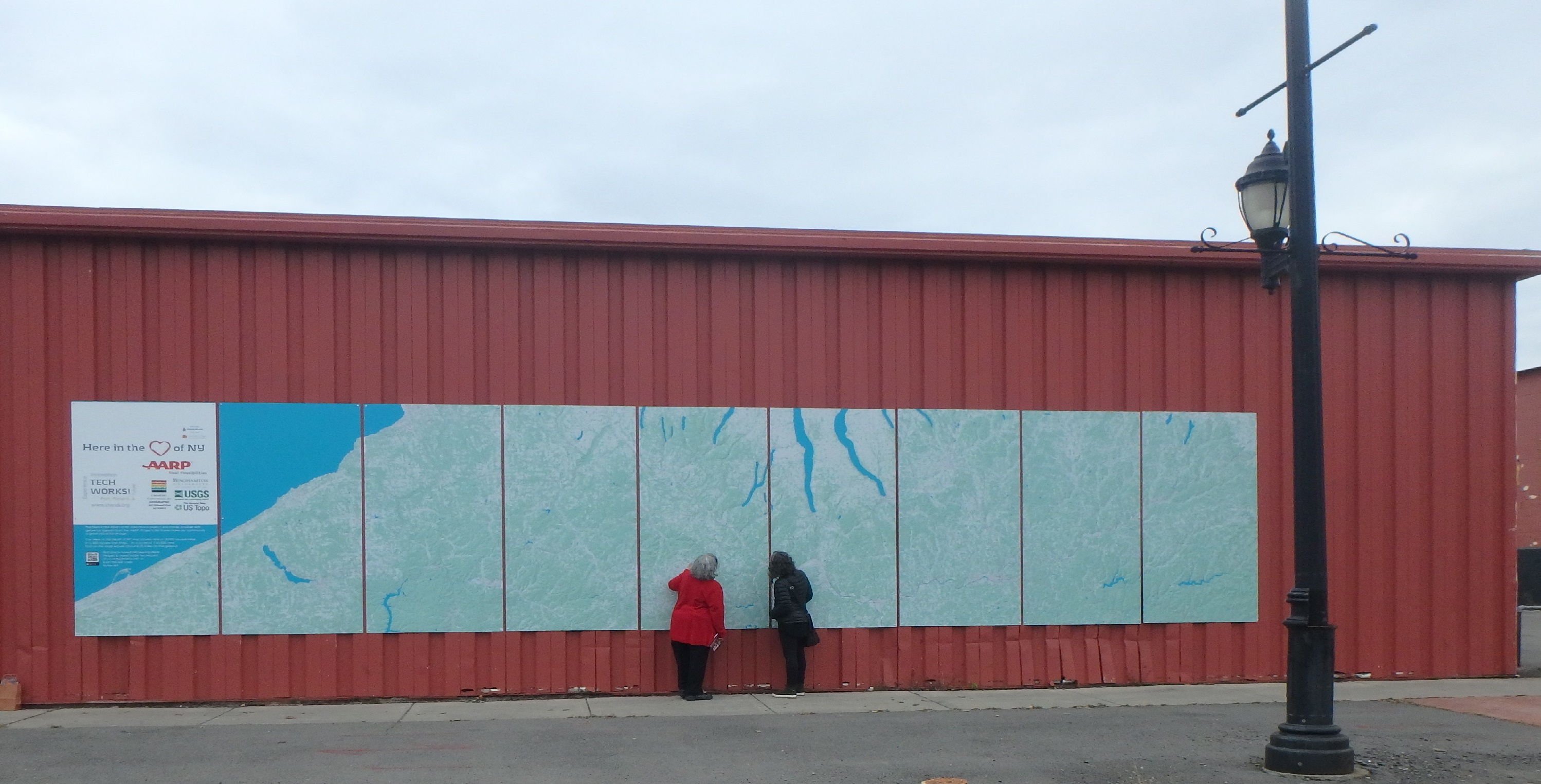
As of November 2018, there’s a new, massive map mural in Binghamton, New York. It was the inspiration of the Center of Technology and Innovation, also known as TechWorks!, a local nonprofit organization whose mission is to document and present in context the inventions and industrial innovations of New York’s Southern Tier. Binghamton and its neighboring cities have a long history of technological innovation, especially in the fields of aviation engineering and manufacturing. For example, the world’s first flight simulator was created in Binghamton and a working version is part of the TechWorks! collection.

TechWorks! was unfamiliar to me until the day in October when I received an email from its executive director, Susan Sherwood, describing this large mapping project they had underway. She’d been given my contact information by a colleague at USGS who knows that I happen to live near Binghamton, and she was wondering if I might be able to offer some “advice, assistance, a Hail Mary perhaps, to figure out the best way to proceed,” as the team had reached an unanticipated technical impasse.

I don’t recall ever actually saying yes to seeing the mapping through to the end. I distinctly remember thinking that perhaps I could troubleshoot problems with the data, then turn everything back over to the others. That would certainly be the best plan of action, I figured, since I’d have been a fool to commit to doing any more than that. (Did I mention that the maps were to be a massive mural, covering over 19,000 square miles of New York and Pennsylvania across nine separate 4-by-8 feet Dibond panels that would be hung onto an outdoor wall of the TechWorks! building? Moreover, to allow time for the printing and installation, Susan estimated we had about ten days before the final digital files had to be turned over to the printer!)

If this story didn’t have a good ending, the disappointment would still be too raw to share it, but miracles do happen and the maps are complete and installed. Many people and institutions came together to make this happen and each played important individual and collaborative roles. On this GIS Day 2018, I’ll share a few of the lessons that I learned through this humbling experience.

 Stay Flexible, since Done is Better than Not Done

As far back as 2012, TechWorks! had envisioned the large map mural as a detailed visual display that illustrated the geographical context of the “ideashed” that was the rich, innovative region of New York’s Southern Tier. Students and faculty at SUNY Binghamton had already compiled and georeferenced historical USGS topographic maps of the full area. This would be a community education outcome, of interest to people of all ages. But the scale and resolution of those raster topos was not reproducing well on these large panels. Deciding to shift instead to using current vector data over a shaded relief background meant abandoning the beauty and details of the historical topos and is what triggered this last-minute need for additional GIS work, but it was a sacrifice necessary for the sake of clear resolution and project completion.

 The USGS Rocks

Data from The National Map are what populate these maps, and by the time I jumped into this project, other people had already decided what the map extent would be and packaged the downloaded data layers into nine large Esri-ready geodatabases. But what made the final maps possible are not just the data, but also this remarkable USGS collection of technical lessons. Did you know that a template exists that allows you to produce USGS-styled topographic maps directly? I didn’t either. Thank you, USGS, for helping people make maps.

 Cartography is Science AND Art

Remember that saying about how your study area will inevitably fall at the intersection of multiple topo quads? Seamless TNM data have moved us beyond the need to mosaic individual quads but we still had to battle with map projections. For this project, Panels 1-5 fall at the western edge of UTM Zone 18N, and Panels 6-9 lie at the eastern side of UTM Zone 17N. No major problem with that, but the span of latitude reminded us that the round Earth and flat Dibond panels needed to be reconciled. Each rectangular panel covered about 66 miles in a north-south direction, from about 41.8˚ to about 42.8˚ north latitude. I wasn’t privy to any of the original data collection or earlier manipulation efforts but it became very apparent very quickly that unless some tweaking was done to the projection parameters, some data would not be orthogonal within their respective rectangles. Installing the panels at an angle or having data gaps at edges was surely not a desirable outcome. Do you spend much time iteratively modifying the central meridians of projections? Me neither. Lo and behold it worked, just as it should, and the most skewed panels were notably less skewed.

The solution for another cartographic issue was more art than science. Bad news: The U.S. national data stops at the edge of the U.S. national border. Unfortunately, the northern ends of Panels 8 and 9 extended significantly past the national border. Good news: Most of the non-U.S. part is the Canadian “half” of Lake Erie, so I created a big blue polygon whose color exactly matched the color that we’d chosen for perennial surface water, and voila, more Lake Erie! Bad news: The most northern part of Panel 9 was actually a small swath of southern Ontario land, and there was no time to gather Canadian GIS data. First solution idea: Given that these panels would be 8 feet tall and were being installed 2-3 feet off the ground, the northwest corner would lie 10-11 feet above the sidewalk where no one could study it carefully. Perhaps we could risk irritating Canada and just have the corner be covered with additional Lake Erie? Cartographic design license, right? Final solution idea: Cover that space with the logos of the project sponsors and contributors. Really, no need to irritate the Canadians further.  
Image

TechWorks! will design magnetic place-markers of historic information that can be temporarily affixed during visits by children and adults alike, a benefit of the maps having been installed onto metal siding.

 Don’t Fear Pro

I’m a long-time user of ArcGIS software and like many of you, I’m still more comfortable with the 10.x versions of ArcMap than Pro. However, I’d made a commitment to teach my fall 2018 introductory GIS class with Pro, and things were going reasonably well in my transition. When I first understood that there would be nine adjacent panels that comprised the full map extent, it seemed that Pro’s Map Series functionality would be a good fit. Of course, I had no idea, yet, how to use it. More problematic is that USGS isn’t using Pro yet, so the TNM templates are only available in ArcMap map document (.mxd) format. My thought was to use the ArcMap-based templates to get the data sorted out, and then import each into Pro. Long story short, it was a painfully slow process that didn’t work well. More importantly, I couldn’t conceive of how to leap from where I was, with nine separate ArcMap documents, to one massive Pro project with multiple gigs worth of data across nine geodatabases, especially since all of this was being done on my whining laptop in the late evening or wee morning hours, with each consecutive day approaching the printer’s deadline.

Within a day, I’d abandoned Pro was completing the cartographic tasks with my trusty ArcMap. I began to export the files to meet the printer’s specifications — at least 300 dpi and as a .pdf file format, which took my computer about 80 minutes per panel to process — and finally I thought I was done…but the easy button never came. In horror, I discovered that every single PDF had unexpected, marring horizontal black lines. They didn’t appear at all in the layouts but they were glaring in the exported files. I asked 25 people to help me diagnose the problem and systematically tried all 25 of their suggestions: changing file formats, changing resolutions, printing to PDF, exporting as something and then changing it to something else, trying it on a different computer, reciting incantations, simmering newt eggs in raspberry juice and waving the tincture over the monitor while holding down the control and shift buttons, etc. Nothing worked and wasted hours slipped into wasted days. The deadline was imminent. In defeat, I surrendered. I zipped up nine packages of beautiful data and perfectly fixed project files and turned them over to Susan, whose optimism never seemed to falter.

The next day, thinking more clearly, I wrote to an Esri cartography expert and described the problem. She asked why I wasn’t using Pro. I couldn’t even remember at that point why I wasn’t, so I started it up and imported one of my fixed map documents. Sixty minutes later, an absolutely flawless 400 dpi PDF of Panel 1 was ready to share with the printers. Repeat eight times. Celebrate with Susan. I still don’t know why ArcMap didn’t want to make that happen but it’s now a moot point for this Pro user.

 Hail Mary Passes

This project was funded through a small grant from AARP’s Liveable Communities Challenge and the budget was primarily intended to cover the maps’ printing and installation. As originally conceived and proposed, the already-compiled historic raster topo maps were to be the data — until things didn’t work as planned. Budgeting for a professional GIS firm had never been part of the picture, nor had it been expected as necessary. Forfeiting the AARP funding by not completing the maps would have been a painful experience for TechWorks!, but how were they to know how complicated making massive digital maps (at a scale of 1:43,500 over 288 square feet of Dibond) could be. There’s no lack of gratitude on their part for the considerable team effort that ultimately made this possible.

When I was asked if there was a logo that I wanted to have on the map, I was in a quandary. I really did do this all on my own time, evenings and weekends, and none of my professional affiliations was fully appropriate. I thought briefly of making one up for SVA (Sucker Volunteers of America), but I had no time to design it. Besides, catching this pro bono Hail Mary pass created many good teaching moments to share in my classroom, and I want my students to feel confident that they could make the same decisions someday. Being one piece of a big community puzzle is rich in learning gains. 

Image

The official unveiling was celebrated in early November. Binghamton Mayor Richard David, Broome County Executive Jason Garnar, and New York State Assemblywoman Donna Lupardo were among the participants.

A Few Hits and a Miss

Last week I had the pleasure of speaking at the annual conference that Harvard’s Center for Geographic Analysis holds. This year the theme was Space & Time in Data Science, and panelists shared stories and nuggets of wisdom for the audience of geographers, geographic information scientists, computer scientists, statisticians, data scientists, and others. Upon prompting for a show of hands about who fell into the different disciplinary categories, many confessed to wearing multiple hats among those roles. Which I think was one point of this event: to foster multi-disciplinary conversations in a place where there aren’t enough going on naturally.

Some of the more noteworthy comments were from:

  • Francisca Dominici, a biostatistician and co-Director of Harvard’s Data Science Initiative, whilst talking about methods for causal inference and scientific reproducibility, wondering whether in fact there exists *anything* that we can really control so we can make inferences about today’s world. She described the CGA as an entity able to help connect the data science talents across campus.
  • Peter Fox, from RPI. He shared the success that the knowledge network behind the Deep Carbon Observatory has been and was refreshingly forthcoming in his description of how attempts at a University Network of Things hasn’t worked. I am increasingly interested in research infrastructure, and knowledge networks are an important component. As an aside, they have a GIS for Science class at RPI but nothing from the syllabus distinguishes it from basic intro GIS course that uses open-source software and apps.
  • Amelia McNamara who had a fountain of ideas I liked, including the notion of an “interactive essay” – like this one one Exploring Histograms. I will definitely be having my students play with this Spatial-Aggregation Explorer.  How Spatial Polygons Shape Our World (YouTube link) officially makes her an honorary geographer in my book. Except I’m not sure she wants to be one. She’s doing just fine with her own disciplines.

I had the second-to-the last slot in the last panel of the day. My own comments focused on the role of strategic communication for strategic bridge building (to better connect GIScience & data scientists). Strategic was to be the key word. I’d say four of my five ideas were reasonably on target but one went up in flames rather spectacularly.

I happen to know one (very bright, very engaged) data scientist who works at a data science company in the Silicon Valley, one that I’d never heard of before (or until recently, since). During a conversation with him earlier this year, I learned that he doesn’t know anything about GIScience AND he’d be interested in knowing more. That was that, and I totally forgot the name of his company until I looked him up again while preparing my talk.

So, on Friday afternoon I said that “data science start-ups might be a good place to broker some worthwhile conversations about GIScience,” and I included a screenshot from the website of the company I’d been holding up as an example, vis a vis their young data scientist who expressed curiosity about GIScience: Palantir.

It was late on a Friday afternoon, at the very end of a long day of intellectual prompts, technical rigor, and gobbledy-gook jargon. Brains were noticeably over-saturated. Time remaining only for a few questions or comments for the panelists. The first person who spoke is a GIScientist known for her critical (i.e., in the academic sense) observations. At that moment I really had no idea what she was saying. Her language may have seemed extra circuitous because my brain was tired or she was politely trying to be less direct. The only thing I really heard was her final emphatic statement that “… we’re not going to work with Palantir!”

Wait, what? She knows the company too? Yup, that Palantir. That’s the one. The one that I suggested to a crowd at Harvard that we GIScientists ought to play more with in the sandbox. Maybe not so strategic after all.

I was nicely wisened up by a few folks as we were departing the conference. In the big scheme of things, as we say in Portuguese, não faz mal.

But I’m left with a bunch of conflicted feelings. I still think that conversations with data scientists at start-ups are a good thing. Not everyone working at Company P is mal-intentioned and sneaky, especially and definitely not my data scientist friend. Life is what you do, not what you say, so we let our actions speak for themselves. I spend way too much time sitting in a small home office by myself in a centrally-isolated patch of land in upstate New York. I crave the chance to develop and brainstorm ideas for talks with colleagues and within a community of practice. I sometimes learn from my mistakes.

Tracking GIS&T Degrees vs. Workforce

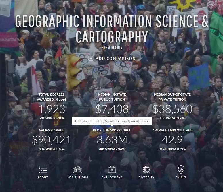
And another thing, told in simple terms from this landing-page image you too can create from this Data USA site.  That number of degrees awarded in 2016 (1,923, which they measure as growing at 5.31%). In 2013, they calculated that there were 1,419 GIS&T degrees granted.

BUT, the “people in the workforce” number, 3.63 million, comes from a much larger group of graduates: all of those considered to have degrees in the “social sciences.” That is not a very helpful way for us to track GIS&T graduates!  We really have no good or confident sense of where graduates are ultimately getting jobs. Tracking recent graduates is notoriously difficult, and I can personally attest to that.

Is our supply of GIS&T graduates well aligned, in quantity and quality, with the actual jobs that they want to go into and that they’re qualified to go into?  A $64,000 question, or if you believe this figure, a $90,421 dollar question (which is ALSO using data from “Social Sciences”!).

ScreenHunter_493 Apr. 24 08.44

Treasure of data access for GIS&T domain

I was about to jump into my regularly scheduled workday when I came across this data visualization tool for educational statistics, whose primary sources are EXACTLY the same ones that I’d been exploring yesterday. How weird is that. And that they had data about “Geographic Information Science & Cartography” at the 6-digit level (much more specific), much more interesting than what they consider its default “comparison” group, “social sciences” at the 2-digit level.

The measurements of “skills” for GIS&T showed a tremendous revealed comparative advantage (RCA) for negotiation, critical thinking, coordination, plus many management of (time/material resources/financial resources) ones. Complex problem solving is the only one that’s also high from another group of skills. RCA is “how much greater or lesser that skill’s rating is than the average,” which I guess means the average rating for that skill for other employment areas (?).  It’s not a surprise that these are high, but it it is interesting that programming and technology design have such a little RCA for us.

ScreenHunter_491 Apr. 24 08.06

Data from O’NET, Department of Labor.

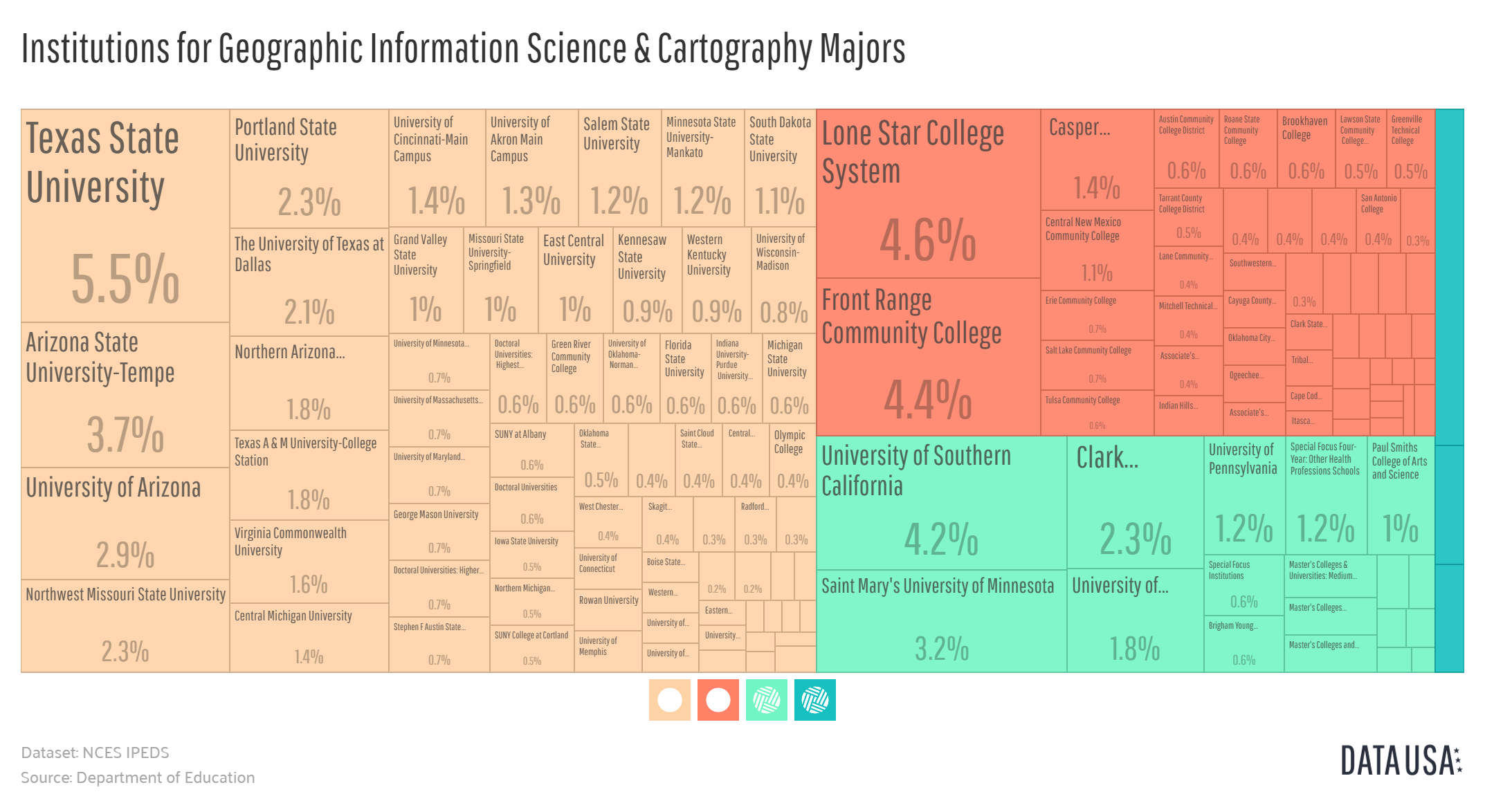
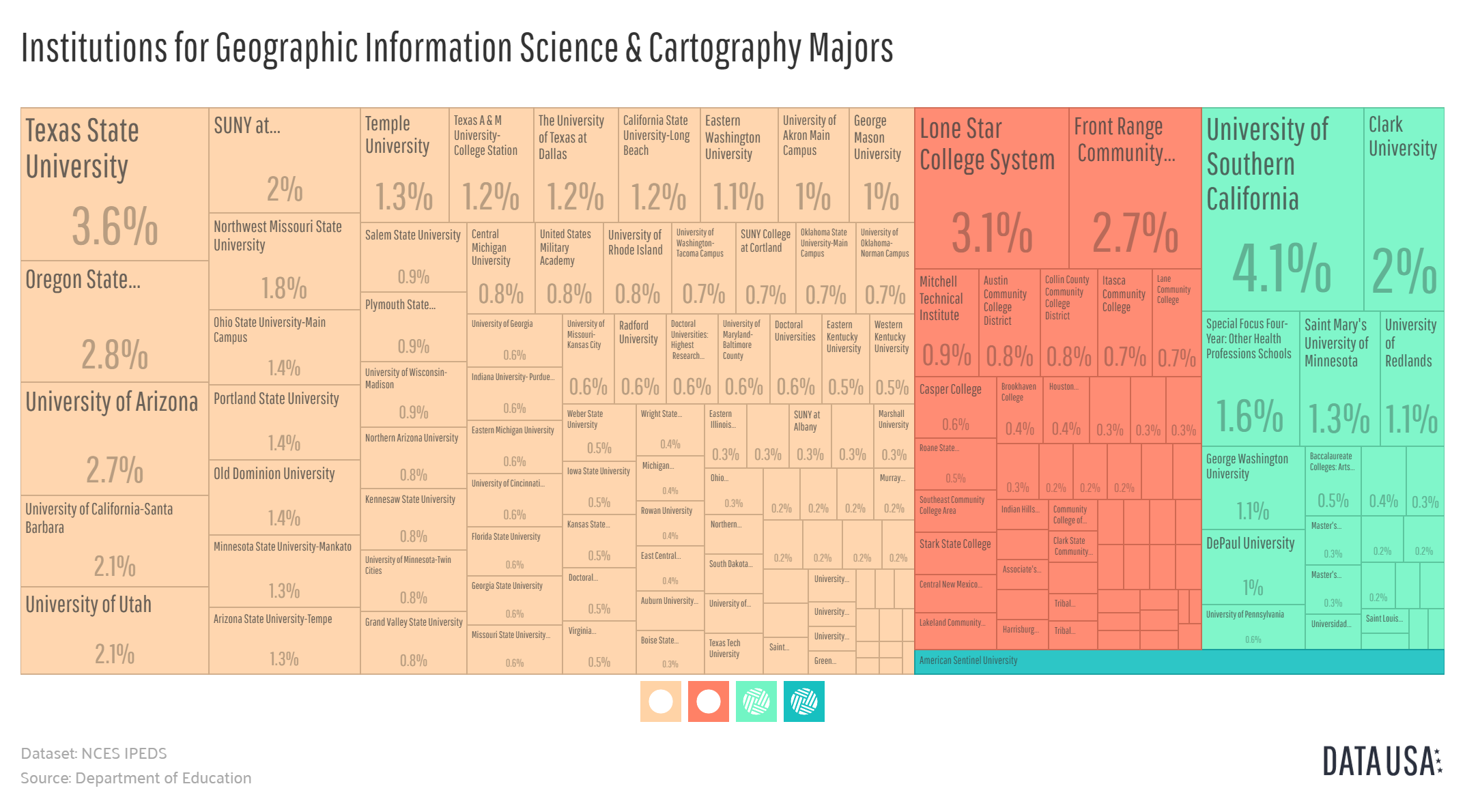
And then there are the tree diagrams of the number of degrees awarded themselves. What’s not very helpful are how they’ve lumped things together into the shaded groups. There is much diversity within each group when you scan across the yellowish ones and the hospital-scrubs-green ones. Like in 2013 when both Texas State University and University of Maine at Machias (hi Tora) are both in the yellow set.  Orange-shaded ones seem to consistently be the community college set.

For the year 20132013 Tree Map of Institutions for Geographic Information Science & Cartography Majors

and for the year 2016:

2016 Tree Map of Institutions for Geographic Information Science & Cartography Majors

Much to explore further here and how lovely that we can download the data themselves. Thank you, open government.

ArcGIS and Jerry Garcia

Who remembers that fun Easter egg that light-hearted Esri programmers slipped into ArcMap back in the early-mid 2000s, back in the ArcGIS 8x days?  Add a new shapefile to a new map, start editing, then type J-E-R-R-Y.  Would never get past the marketing folks these days. Sigh. Can’t a mapper have any fun anymore?

geospatial Professional Certification options

OGC, the Open Geospatial Consortium, is hosting a survey to collect thoughts on OGC-related Professional Certifications. I’m a huge fan of the mission of OGC and its methods as well, and to allow someone to earn a credential in this area should increase the likelihood of advancing towards greater adoption and implementation. Being anxious about credentials – designed and managed and articulated-well – is short-sighted.