I’d like to make this my screen saver. http://hint.fm/wind/
h/t to many on Twitter, including @ajturner and @mrgeog.

I’d like to make this my screen saver. http://hint.fm/wind/
h/t to many on Twitter, including @ajturner and @mrgeog.
Posted in data & visualization, maps
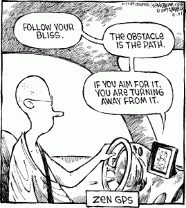
I wandered across a fun mapping and GIS blog recently, Blue Sky GIS. They’ve collected (and generated) some fine ones, like this:
Posted in humor, maps, navigation & GPS
A post from somewhere recently (the Atlantic?) keyed me into the work done by John Nelson at IDV User Experience, such as Thiessen polygons of Craig’s Lists boundaries. Then I wandered onto a similar approach for Massachusett’s Dunkin Donuts regions by PasteInPlace. Soon the indefatigable Seth Dixon had pointed me towards the US Personality map. Next thing I knew, I was back to John Nelson’s production of the US according to its Google Autocompletes. (Which reminded me of the Google Making us Dumber site, which I see has become stale, or maybe it was this Oddee list I was remembering.)
Just a few bookmarks after a Sunday night hour of procrastination…
Posted in daily life, humor, maps
I’m still digesting the surplus of ideas, information, and stimuli that came through as overload during last week’s AAG conference in NYC. One of the tracks that I’d have hoped to get to (if I could clone myself, and have the double arrive pre-loaded with more energy) was held at the New York Public Library, focusing on the use of historical maps and data in a number of ways. I did have friends at those sessions, however, and one of them – Chris Gist from UVA- came to dinner one night full of enthusiasm for the plans around oldmapsonline.org. I suppose such a wonderful level of contributed sharing was inevitable in today’s world of VGI. Bring on the temporal/spatial change studies!
NYPL is also known for their innovative use of open-source tools to crowd source the georeferencing of their own collection of maps and images.
Posted in humanities, maps, web mapping
My dad just forwarded me this Slate story on Kirk Goldsberry’s basketball study. Kirk is a fellow GIS-in-higher-ed enthusiast, currently at Harvard’s GIS Center. He presented his study at the Sloan Sports Analytics Conference; you can get a pdf of it from there too. I love it when the popular press picks up on stories like these, as it makes the ongoing GIS awareness campaign all the more fun! Nice work, Kirk!
Kirk’s study reminded me immediately of one done by an undergrad student at St. Lawrence University several years ago. Travis Gingras, a hockey goalie and GIS intern, similarly mapped the patterns of successful hockey shots. He won the (now defunct) Churchill Prize from NITLE for his mapping efforts.
One of my EDUC 616 students forwarded me this page, a collection of maps that illustrate the infamous “lying with maps” potential. It’s a nice page for the Canadian national libraries to maintain! Don’t overlook the “test yourself” section at the bottom; it’s a great use of maps and their histories to offer a complete mini-lesson on map interpretation pitfalls.
Posted in maps
I came across two sites this week that used maps in well-designed ways to visualize migratory patterns. I have an ongoing interest in finding clever and innovative ways to represent flow and movement.
The first was Geo-Mexico, and I first saw their simple-but-elegantly-effective Flash-based maps to link individual Mexican states to the areas in the US, based on registering with consulates. Then I remembered helping my colleague Steve to map remittances so I smiled when I saw this nice overview and a lesson to boot! I’ll definitely follow this site more. Hat tip to Seth Dixon’s Geography Education for the find.
Much more mesmerizing are these animated maps of annual bird movements, from my local-but-still-unknown Cornell Lab of Ornithology and the National Audubon Society. I’m not a birder myself and have great respect for those who can differentiate more than from amongst crows and starlings (i.e., my skill level). I checked out the patterns of birds whose names suggested they know their home, like the Kentucky Warbler and the Louisiana Waterthrush (what’s up with that little patch in southwestern South Dakota in April/May? a particularly active citizen-science group or an interesting modeled anomaly?). I love how the Indigo Bunting aligns with the Mississippi in July and August. These maps represent the results of models: they don’t reflect actual observations at all of those locations. But they do show the power of visualization when ground truthed, primary data are combined with our large collections of other geospatial information.
Posted in data & visualization, geography, maps, time, web mapping
The north-upness of maps is a curiosity that geographers and cartographers have perpetuated for many years, and pondered as well. It’s interesting to think about this from the historical perspectives (like when the East prevailed) as well as the psychological outcomes of this tendency.
In my Foundations of Spatial Literacy course, we’re talking about egocentric and allocentric perspectives this week. If you’re an iPhone user, don’t forget that you have the capability to modify your mapping perspective! North need not always be up! Though I do love it when I hand my phone to my kids in the car for navigating our directions and I hear their brains working to convert the perspective to whether I’m to turn right or left. The little blue blinking dot, àla Marauder’s map, would make my top 10 favorite technological developments of the decade.
Northness is one of Kristi Alvarez’s favorite map and geography tid-bits. More than once she teased me for being north/up-centric. Bless your solid geographical sense, Kristi, and all of the learning that you have inspired in me. I miss you.
Matthew Ericson, the deputy graphics director at the NY Times, posted recently about making wise mapping choices. His explanations draw nicely from data visualization guidelines, and I remember showing those New Orleans maps to my students. “When the interesting patterns aren’t geographic patterns” is what I’ve referred to in the past as “graphs and charts that display geographic data with alternative representations of space.” I talked about this category earlier this month at Georgetown’s Center for New Designs in Learning & Scholarship. GapminderWorld’s chart is a classic example. Their “map” tab is a bit of a bore…
I’m not sure whether she’s still at this job, but I liked this 2007 interview that mapmaker Erin Aigner gave about her work at the NY Times.
Posted in data & visualization, maps
I happened across this NYT opinion piece today on borders. It’s by Frank Jacobs, the esteemed blogger from Strange Maps. It’d be nearly impossible to keep track of historical European “national” boundaries without mapped representations.
Staying fixed in one location, but having that one location be considered different places over time, reminded me of the research into how and when children develop their sense of nested or hierarchical space. That I am in Ithaca and New York and the United States, all at the same time. And that I can be a concurrent Ithacan and New Yorker and United Statesian (sometimes I resist American). Piaget and Weil studied this for Swiss children.
Piaget, J., & Weil, A.-M. (1951). The development in children of the idea of the homeland and of relations with other countries. International Social Science Bulletin, 3, 571-578.
The NYT piece also reminded me of Edward Casey‘s musings about fixed borders and porous boundaries. I heard him speak once at Redlands and was captivated at a philosopher’s take on the topic. I would have loved the time to sit down with him in front of a GIS and muse on its points, lines, and polygons.
Here’s a link to his Edges and the In-Between essay (pdf).
