Candid Observations about the GISP Credential, From the Inside and Out

T minus 23 years: Phew, done with grad school. Earned the degree I’ll need to teach and research, or something. What I really like doing is this mapping stuff. At least I won’t have to take any more tests. 

T minus 15 years: Overheard a conversation with some friends at a conference about this new GIS credential program. Know about it? Me neither. Sounds like they’re still figuring it out. 

T minus 13 years: Maybe it’s time to look into this GISP thing some more. A couple of colleagues said it wasn’t too difficult to organize the documents they’d needed. Can’t hurt to get it and I’m curious to know more about the process. 

T minus 12 years: I hear they’re now designing a test that people will have to take in the future, unless you apply now and are grandfathered in. (Or grandmothered, right?) I need to get this figured out now and skip the test, thank you. (That was one benefit of having started with GIS in the early 1990s. Remember when we used to have to type things in at the command line? Remember when you could test for dangles by telling the program to display them in red, and then you could “kill” them and build clean topology? Those were the days.) 

T minus 11 years: Wow, really? The deadline to grandfather in is really this December 31? Like December of this year? As in, a few months from now? Ugh, work is really busy. Hmmm. Maybe they’ll extend it. 

T minus 10 years, 11 months: Bummer. 

T minus 5 years: Yea, I know, I keep thinking about it. I mean, I don’t really need it for my actual day job right now but a few of my students have asked me about it. Not sure what to tell them. Are they aspiring to be a GIS analyst? GIS manager? GIS coordinator? What do the job descriptions say? Are they learning what they need to know? Do I know what they need to know? Do I know what I need to know? Did I ever tell you about when we had to write AML code to get a map to print? 

T minus 2 years: This is silly. Just get the damn thing. You know you’re curious. You haven’t taken a standardized test since the late 1980s but you weren’t scared of them then. Be bold! Be proud! You’ve got this! I create a new folder on my computer called “GISP” and do an online search for test prep materials. Download a mishmash of things. Make a mental note to start reading them. 

T minus 1 year, 10 months: Create an account on the GISCI website and start the portfolio documentation process. Try to remember the conferences I’ve been to, the webinars I’veattended, the papers and articles I’ve written, the classes and workshops I’ve taught — many more than I need right now. Gently kick myself for not having gotten organized to do the grandfathering thing years ago. Wipe up the spilt milk and get over it.

T minus 1 year: I really ought to study one of these days. Almost 45% of the exam is on “Design Aspects & Data Modeling” and “Data Manipulation.” I haven’t been asked questions about those topics in a long time, though I “do” those things with my students and for my own occasional projects. If you do something, you should be able to pick a correct answer from a multiple-choice test, right? Right? Except, let’s be real, I don’t do those things every day. For every hour in a class that I spend on schemas, domains, and user permissions, I spend another hour encouraging my students to remember, “What did you name it and where did you save it?” Hmmm. This is going to be interesting. 

T minus 7 months: Mention to a colleague that I am planning to pursue my GISP. He is the top GIS executive in a nearby county and is amused that I am putting myself through the process. Says that they don’t go out of their way to hire anyone because of having this credential, though it doesn’t count against the person if they do. Well I should hope not! He concurs that it does demonstrate at least a basic amount of knowledge around a breadth of GIS topics. That’s what a credential is — external evidence that one has satisfied a minimum set of standards to be considered suitable or suited for something. He’s reserving judgement about what else the credential may one day represent or offer. We figure the profession and its practitioners own the process and the outcome, so it can set its standards high and follow through. 

T minus 4 months: Take a few hours on a snowy Saturday afternoon to finally complete the portfolio, then prepare to pay a healthy sum of money to submit it for review. Gulp. That’s a lot of money for something that’s not a necessary condition for my employment. Experience a powerful sense of disinclination. Doubt my commitment. Question my motivations. Listen to the voice in my head that says I know I want to prove to myself that I can do this. Hit the submit button. 

T minus 3 months: Woo-hoo, my portfolio was approved. One significant hurdle left. Now it’s really time to study for the exam. Stop by my office to grab a few books about things I may or may not once have known. I stack them neatly and with great anticipation in a pile next to my reading chair. If I make the stack tall enough, it can double as a resting place for coffee mugs.

T minus 6 weeks: Get sucked down a few internet rabbit holes for my search on “Should I get the GISP.” Wow, there are some bitter people out there! Sometimes I envision a GISP plate being balanced and spun about on the tip of a pole. There’s a lot of GIS that we think could fit on to that plate and the process to sample from it can come from anyone in the restaurant, from any professional discipline that might somehow intersect with GIS. Know too much from one side of the plate and don’t know (or care) about the other portions, there’s a good chance it’ll tip the wrong way. Is there enough steadiness with GIS to have it be a meaningfully full and balanced plate? Will a demand for broadly-trained GIS professionals be enduring enough to warrant having knowledge across all parts of the plate? Sideline skeptics need not be silenced, but more people with skin in the game should get involved too. It’s a big tent with space for many voices to make this the best it could be.

T minus 3 weeks: If I review material for 30 minutes every day from here out, I can still fit in about 10 more hours of studying before the test. That will be enough at this point. 

T minus 2 weeks: Well, that didn’t work. If I review material for 20 minutes every day from here out, I can still fit in about 5more hours of studying before the test. That will have to be enough at this point.

T minus 8 days: Manage to carefully read and take notes from several consecutive chapters in a current and well-regarded GIS textbook. Focus on the content that I haven’t dealt with in a long time, much of which also happens to be the stuff that changes most rapidly in this dynamic field of ours. The test is taking place in the days right before the absolute busiest time of my work year but there is no good time. Just get it done.

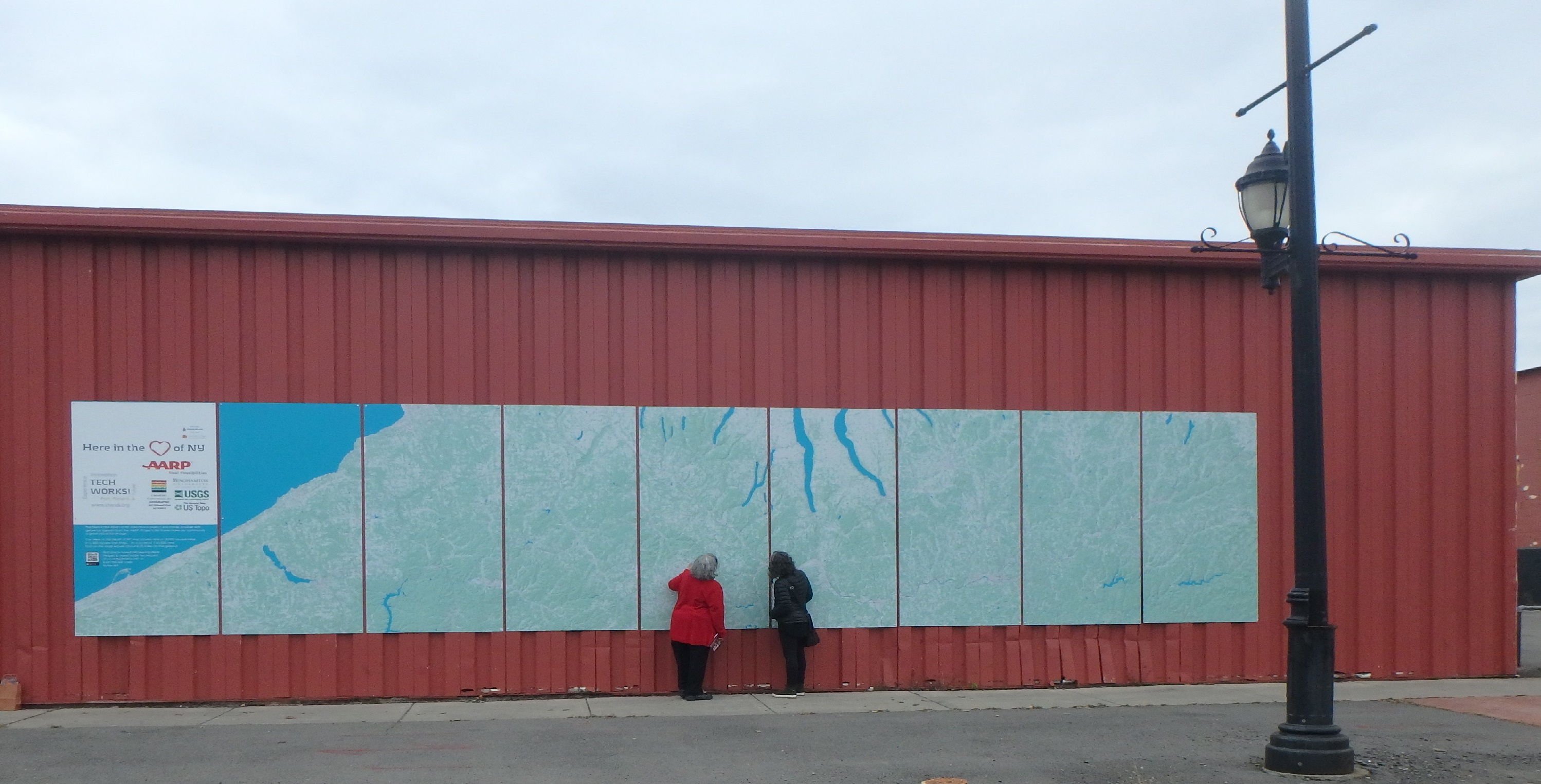
T minus 4 days: Need to mow the lawn. Need to study. It’s going to rain later today. The yard is big and the grass is long. I mow. My mind wanders to GIS. Push the mower up the fields and across the records. Stop (in a cell) and dig out clippings from the mower vent. If I were in a raster cell, what would the resolution be to have this pixel be considered grass? What commercial satellites could detect how many weeds were in this pixel? What temporal resolution would I need to capture the explosion of dandelions in the last few days? If I classify the whole dang yard into two raster categories of grass and dandelions, what would its table look like if I compressed it with run-length encoding? I struggle to push the mower up the steep slope on the side of the house. Does this show up on a DEM? Forget about the whole slope, I’ll just cut a few swaths across. Like contour lines. A line on a map joining points of equal elevation. . But not truly all equal. I’ll set my mowing standards low, to allow for a high proportion of the lines’ predicted values to be 50 percent plus or minus from its stated value, based on my contour interval. I pause to pick up a small stick and throw it towards the fire pit. It misses. I throw another. It too misses and falls far away from the first one. I have been neither precise nor accurate. I later recount to my husband all that I have reviewed. For both of our sakes, he hopes this process ends soon. 

T minus 1 day: We’re invited to a friend’s home for dinner. I can’t go, I say, I have to wake up early in the morning and drive an hour away to take a long test. Bring your flash cards, they say, we’ll quiz you. Flash cards? Someone should make a set as a study aide. Union! Intersect! Merge! Dissolve! Geoid! Ellipsoid! Spheroid! Datums! Conformal! Conic! Equal Interval! Quantile! What a fun social evening that would have been! (Insert rolling eyes emoji here). 

T plus 1 day: Don’t know results yet. Driving home from the 4-hour exam I had small waves of confidence when I think about a question that I know I must have gotten right, countered with small waves in the other direction when I remember having no clue and laughing out loud (quietly, testing in progress). I had some time at the end of the exam to review my responses. A little exhilarating, a lot exhausting, mixed in with a healthy dose of self-questioning.  

T plus 10 days: Still don’t know results. The more time that passes, I’m increasingly uncertain which way the plate will tip. It was a worthwhile part of the process to be reassured about what I do know. I learned some new things along the studying path, and, sure enough, confirmed for myself that there’s plenty that I don’t know well. Going forward I’m better prepared to coach the students who might want to pursue this on their own. This geospatial credential is definitely not needed for everyone, but I feel even more strongly that if we care about this profession and want to promote it for the long haul, engaging with this one piece of the professionalism process is one small and worthwhile personal step to take.

P.S. Directions Magazine is pleased to share the news that Diana Sinton did indeed pass the exam and will proudly join the ranks of fellow GISP holders worldwide.


You might be interested in:

Podcast: What You Need to Know about GISP Certification – Requirements, Benefits and Study Tips

GIS Jobs: Current Industry Expectations

GIS Jobs of Today series 

What do scientists do that is spatial, and why?

Too many other writing projects lately, none of which I manage to trickle over – or prioritize – to this blog. Modern life and first-world problem.

One thought-full activity lately has been my spatial science framework. In hindsight, we know that spatial thinking informs STEM success. But how? What are the underlying mechanisms that support that relationship? Why, and what are the spatial practices of STEM (individuals and groups) that are implemented? Can we build a simple DACUM around those practices and behaviors?

Step #1. Collect the evidence. Step #2: Arrange the evidence. Working on it.

Podcast: What You Need to Know about GISP Certification – Requirements, Benefits and Study Tips

DirectionsMag has partnered with URISA’s Vanguard Cabinet to bring you a collection of podcasts and resources to enhance your professional development.  This edition focuses on GISP certification, what’s required and shared experiences. We are joined by a panel of geospatial professionals, including Bill Hodge, Executive Director of GISCI.

You can also download or listen via iTunes.

Video


Content

00:42 – Introductions

07:55 – What’s required to get your GISP? Why bother?

15:50 – What was your experience with the exam? How did you prepare?

27:15 – What changes or benefits have you experienced since acquiring your GISP?

30:41 – How many points do you need?

34:33 – What’s recertification like?

36:14 – What’s the expense? Do employers help with the expense?

39:17 – How important is the GISP in hiring?

41:27 – Does software matter when getting our GISP?

45:40 – What was the most challenging part of getting your GISP?


Resources

GIS Certification Institute (GISCI) – https://www.gisci.org/ 

Exam:

Mentoring Programs:

Webinars & Articles:

“The GIS&T BoK: Where is it now, and where will YOU take it tomorrow?” – Diana Sinton

All You Need to Know about the New Body of Knowledge – webinar

UAV Webinars https://drones.directionsmag.com/

“10 Tips for Passing the FAA’s Part 107 Knowledge Exam” – Wing Cheung and Sean Figg

“5 Tips for Passing the FAA’s Part 107 Recurrent Knowledge Test” – Wing Cheung

Other Certifications:

Esri – https://www.esri.com/training/certification/

GEOINT –  https://usgif.org/certification

Maps that Become Possible with a Little Help from your Friends

Editor’s Note: Happy GIS Day 2018!  We’ve all had that GIS career moment when someone needs a “little help” with a map project.  Hours turn to days as your “small” project grows beyond your expectation.  Enjoy the journey and lessons learned from our own Dr. Diana Sinton as she shares her recent adventure in volunteer cartography.

As of November 2018, there’s a new, massive map mural in Binghamton, New York. It was the inspiration of the Center of Technology and Innovation, also known as TechWorks!, a local nonprofit organization whose mission is to document and present in context the inventions and industrial innovations of New York’s Southern Tier. Binghamton and its neighboring cities have a long history of technological innovation, especially in the fields of aviation engineering and manufacturing. For example, the world’s first flight simulator was created in Binghamton and a working version is part of the TechWorks! collection.

TechWorks! was unfamiliar to me until the day in October when I received an email from its executive director, Susan Sherwood, describing this large mapping project they had underway. She’d been given my contact information by a colleague at USGS who knows that I happen to live near Binghamton, and she was wondering if I might be able to offer some “advice, assistance, a Hail Mary perhaps, to figure out the best way to proceed,” as the team had reached an unanticipated technical impasse.

I don’t recall ever actually saying yes to seeing the mapping through to the end. I distinctly remember thinking that perhaps I could troubleshoot problems with the data, then turn everything back over to the others. That would certainly be the best plan of action, I figured, since I’d have been a fool to commit to doing any more than that. (Did I mention that the maps were to be a massive mural, covering over 19,000 square miles of New York and Pennsylvania across nine separate 4-by-8 feet Dibond panels that would be hung onto an outdoor wall of the TechWorks! building? Moreover, to allow time for the printing and installation, Susan estimated we had about ten days before the final digital files had to be turned over to the printer!)

If this story didn’t have a good ending, the disappointment would still be too raw to share it, but miracles do happen and the maps are complete and installed. Many people and institutions came together to make this happen and each played important individual and collaborative roles. On this GIS Day 2018, I’ll share a few of the lessons that I learned through this humbling experience.

 Stay Flexible, since Done is Better than Not Done

As far back as 2012, TechWorks! had envisioned the large map mural as a detailed visual display that illustrated the geographical context of the “ideashed” that was the rich, innovative region of New York’s Southern Tier. Students and faculty at SUNY Binghamton had already compiled and georeferenced historical USGS topographic maps of the full area. This would be a community education outcome, of interest to people of all ages. But the scale and resolution of those raster topos was not reproducing well on these large panels. Deciding to shift instead to using current vector data over a shaded relief background meant abandoning the beauty and details of the historical topos and is what triggered this last-minute need for additional GIS work, but it was a sacrifice necessary for the sake of clear resolution and project completion.

 The USGS Rocks

Data from The National Map are what populate these maps, and by the time I jumped into this project, other people had already decided what the map extent would be and packaged the downloaded data layers into nine large Esri-ready geodatabases. But what made the final maps possible are not just the data, but also this remarkable USGS collection of technical lessons. Did you know that a template exists that allows you to produce USGS-styled topographic maps directly? I didn’t either. Thank you, USGS, for helping people make maps.

 Cartography is Science AND Art

Remember that saying about how your study area will inevitably fall at the intersection of multiple topo quads? Seamless TNM data have moved us beyond the need to mosaic individual quads but we still had to battle with map projections. For this project, Panels 1-5 fall at the western edge of UTM Zone 18N, and Panels 6-9 lie at the eastern side of UTM Zone 17N. No major problem with that, but the span of latitude reminded us that the round Earth and flat Dibond panels needed to be reconciled. Each rectangular panel covered about 66 miles in a north-south direction, from about 41.8˚ to about 42.8˚ north latitude. I wasn’t privy to any of the original data collection or earlier manipulation efforts but it became very apparent very quickly that unless some tweaking was done to the projection parameters, some data would not be orthogonal within their respective rectangles. Installing the panels at an angle or having data gaps at edges was surely not a desirable outcome. Do you spend much time iteratively modifying the central meridians of projections? Me neither. Lo and behold it worked, just as it should, and the most skewed panels were notably less skewed.

The solution for another cartographic issue was more art than science. Bad news: The U.S. national data stops at the edge of the U.S. national border. Unfortunately, the northern ends of Panels 8 and 9 extended significantly past the national border. Good news: Most of the non-U.S. part is the Canadian “half” of Lake Erie, so I created a big blue polygon whose color exactly matched the color that we’d chosen for perennial surface water, and voila, more Lake Erie! Bad news: The most northern part of Panel 9 was actually a small swath of southern Ontario land, and there was no time to gather Canadian GIS data. First solution idea: Given that these panels would be 8 feet tall and were being installed 2-3 feet off the ground, the northwest corner would lie 10-11 feet above the sidewalk where no one could study it carefully. Perhaps we could risk irritating Canada and just have the corner be covered with additional Lake Erie? Cartographic design license, right? Final solution idea: Cover that space with the logos of the project sponsors and contributors. Really, no need to irritate the Canadians further.  

Image

TechWorks! will design magnetic place-markers of historic information that can be temporarily affixed during visits by children and adults alike, a benefit of the maps having been installed onto metal siding.

 Don’t Fear Pro

I’m a long-time user of ArcGIS software and like many of you, I’m still more comfortable with the 10.x versions of ArcMap than Pro. However, I’d made a commitment to teach my fall 2018 introductory GIS class with Pro, and things were going reasonably well in my transition. When I first understood that there would be nine adjacent panels that comprised the full map extent, it seemed that Pro’s Map Series functionality would be a good fit. Of course, I had no idea, yet, how to use it. More problematic is that USGS isn’t using Pro yet, so the TNM templates are only available in ArcMap map document (.mxd) format. My thought was to use the ArcMap-based templates to get the data sorted out, and then import each into Pro. Long story short, it was a painfully slow process that didn’t work well. More importantly, I couldn’t conceive of how to leap from where I was, with nine separate ArcMap documents, to one massive Pro project with multiple gigs worth of data across nine geodatabases, especially since all of this was being done on my whining laptop in the late evening or wee morning hours, with each consecutive day approaching the printer’s deadline.

Within a day, I’d abandoned Pro was completing the cartographic tasks with my trusty ArcMap. I began to export the files to meet the printer’s specifications — at least 300 dpi and as a .pdf file format, which took my computer about 80 minutes per panel to process — and finally I thought I was done…but the easy button never came. In horror, I discovered that every single PDF had unexpected, marring horizontal black lines. They didn’t appear at all in the layouts but they were glaring in the exported files. I asked 25 people to help me diagnose the problem and systematically tried all 25 of their suggestions: changing file formats, changing resolutions, printing to PDF, exporting as something and then changing it to something else, trying it on a different computer, reciting incantations, simmering newt eggs in raspberry juice and waving the tincture over the monitor while holding down the control and shift buttons, etc. Nothing worked and wasted hours slipped into wasted days. The deadline was imminent. In defeat, I surrendered. I zipped up nine packages of beautiful data and perfectly fixed project files and turned them over to Susan, whose optimism never seemed to falter.

The next day, thinking more clearly, I wrote to an Esri cartography expert and described the problem. She asked why I wasn’t using Pro. I couldn’t even remember at that point why I wasn’t, so I started it up and imported one of my fixed map documents. Sixty minutes later, an absolutely flawless 400 dpi PDF of Panel 1 was ready to share with the printers. Repeat eight times. Celebrate with Susan. I still don’t know why ArcMap didn’t want to make that happen but it’s now a moot point for this Pro user.

 Hail Mary Passes

This project was funded through a small grant from AARP’s Liveable Communities Challenge and the budget was primarily intended to cover the maps’ printing and installation. As originally conceived and proposed, the already-compiled historic raster topo maps were to be the data — until things didn’t work as planned. Budgeting for a professional GIS firm had never been part of the picture, nor had it been expected as necessary. Forfeiting the AARP funding by not completing the maps would have been a painful experience for TechWorks!, but how were they to know how complicated making massive digital maps (at a scale of 1:43,500 over 288 square feet of Dibond) could be. There’s no lack of gratitude on their part for the considerable team effort that ultimately made this possible.

When I was asked if there was a logo that I wanted to have on the map, I was in a quandary. I really did do this all on my own time, evenings and weekends, and none of my professional affiliations was fully appropriate. I thought briefly of making one up for SVA (Sucker Volunteers of America), but I had no time to design it. Besides, catching this pro bono Hail Mary pass created many good teaching moments to share in my classroom, and I want my students to feel confident that they could make the same decisions someday. Being one piece of a big community puzzle is rich in learning gains. 

Image

The official unveiling was celebrated in early November. Binghamton Mayor Richard David, Broome County Executive Jason Garnar, and New York State Assemblywoman Donna Lupardo were among the participants.

20 Years of Top Geospatial Content at DirectionsMag

Directions Magazine is woven into the geospatial community’s fabric, since 1998. With a loyal following, we endeavor to honor that trust with a variety of articles, webinars, and news to keep you at the top of your game, inspire you to make a difference, and encourage growth. Today we bring you a taste of the most clicked articles and webinar topics.

Articles

Our top two articles speak to the importance of foundations. Geography and how we use it to communicate are at the center of these two pieces. Even today, these are the most read articles on our site.

  • A More Realistic View of Our World,” published in 1999, by Ramona Currie explores projection. Every GIS professional can empathize with this cartographic decision.
  • Geography and Everyday Life,” published in 2000, by Reginald Golledge takes a look at geography and how spatial we are. It includes a self-assessment quiz.

The next most popular pieces speak to specific or emerging fields:

 The next most popular items are related to job skills and job acquisition:

We encourage you to explore the many topics from our archives and recent posts to enhance your geospatial knowledgebase.

Webinars

We often hear about the benefits of our webinars. One recent story speaks not only to the DirectionsMag program but also to the many opportunities across the geospatial community to educate and enhance our skills. One loyal webinar listener shared her experience with us.

“Both institutions [with which I work] recently had major certification reviews. Both review boards questioned keeping me in a teaching capacity – until I provided transcripts and proof of the number of courses, trainings, MOOCs, webinars, tutorials, activities, projects, etc., that I completed in an effort to learn more about GIS, data collection, remote sensing, and other topics relevant to the courses in our programs. They were so impressed with the list of learning options I’d provided, including several webinars from you, that they withdrew any objections to keeping me. Thank you so much for providing the quality webinars, with expert presenters and resources, that help me learn more to share with my students. I appreciate it!”

We have many vendor webinars that demonstrate how tools and services can make you more efficient. We also have many webinars to support your education or discuss prominent issues. Explore the webinar archives today. It’s clear to us that you, the geospatial professionals care about topics affecting your work. Some of our most popular topics are:

Whatever your interest, thank you for supporting DirectionsMag. We hope that you will continue to read, watch, and especially share our content with all your geospatial friends. 

If you have ideas, or are interested in writing or sharing your organization’s expertise, send a note to editors@directionsmag.com.

A Few Hits and a Miss

Last week I had the pleasure of speaking at the annual conference that Harvard’s Center for Geographic Analysis holds. This year the theme was Space & Time in Data Science, and panelists shared stories and nuggets of wisdom for the audience of geographers, geographic information scientists, computer scientists, statisticians, data scientists, and others. Upon prompting for a show of hands about who fell into the different disciplinary categories, many confessed to wearing multiple hats among those roles. Which I think was one point of this event: to foster multi-disciplinary conversations in a place where there aren’t enough going on naturally.

Some of the more noteworthy comments were from:

  • Francisca Dominici, a biostatistician and co-Director of Harvard’s Data Science Initiative, whilst talking about methods for causal inference and scientific reproducibility, wondering whether in fact there exists *anything* that we can really control so we can make inferences about today’s world. She described the CGA as an entity able to help connect the data science talents across campus.
  • Peter Fox, from RPI. He shared the success that the knowledge network behind the Deep Carbon Observatory has been and was refreshingly forthcoming in his description of how attempts at a University Network of Things hasn’t worked. I am increasingly interested in research infrastructure, and knowledge networks are an important component. As an aside, they have a GIS for Science class at RPI but nothing from the syllabus distinguishes it from basic intro GIS course that uses open-source software and apps.
  • Amelia McNamara who had a fountain of ideas I liked, including the notion of an “interactive essay” – like this one one Exploring Histograms. I will definitely be having my students play with this Spatial-Aggregation Explorer.  How Spatial Polygons Shape Our World (YouTube link) officially makes her an honorary geographer in my book. Except I’m not sure she wants to be one. She’s doing just fine with her own disciplines.

I had the second-to-the last slot in the last panel of the day. My own comments focused on the role of strategic communication for strategic bridge building (to better connect GIScience & data scientists). Strategic was to be the key word. I’d say four of my five ideas were reasonably on target but one went up in flames rather spectacularly.

I happen to know one (very bright, very engaged) data scientist who works at a data science company in the Silicon Valley, one that I’d never heard of before (or until recently, since). During a conversation with him earlier this year, I learned that he doesn’t know anything about GIScience AND he’d be interested in knowing more. That was that, and I totally forgot the name of his company until I looked him up again while preparing my talk.

So, on Friday afternoon I said that “data science start-ups might be a good place to broker some worthwhile conversations about GIScience,” and I included a screenshot from the website of the company I’d been holding up as an example, vis a vis their young data scientist who expressed curiosity about GIScience: Palantir.

It was late on a Friday afternoon, at the very end of a long day of intellectual prompts, technical rigor, and gobbledy-gook jargon. Brains were noticeably over-saturated. Time remaining only for a few questions or comments for the panelists. The first person who spoke is a GIScientist known for her critical (i.e., in the academic sense) observations. At that moment I really had no idea what she was saying. Her language may have seemed extra circuitous because my brain was tired or she was politely trying to be less direct. The only thing I really heard was her final emphatic statement that “… we’re not going to work with Palantir!”

Wait, what? She knows the company too? Yup, that Palantir. That’s the one. The one that I suggested to a crowd at Harvard that we GIScientists ought to play more with in the sandbox. Maybe not so strategic after all.

I was nicely wisened up by a few folks as we were departing the conference. In the big scheme of things, as we say in Portuguese, não faz mal.

But I’m left with a bunch of conflicted feelings. I still think that conversations with data scientists at start-ups are a good thing. Not everyone working at Company P is mal-intentioned and sneaky, especially and definitely not my data scientist friend. Life is what you do, not what you say, so we let our actions speak for themselves. I spend way too much time sitting in a small home office by myself in a centrally-isolated patch of land in upstate New York. I crave the chance to develop and brainstorm ideas for talks with colleagues and within a community of practice. I sometimes learn from my mistakes.

Tracking GIS&T Degrees vs. Workforce

And another thing, told in simple terms from this landing-page image you too can create from this Data USA site.  That number of degrees awarded in 2016 (1,923, which they measure as growing at 5.31%). In 2013, they calculated that there were 1,419 GIS&T degrees granted.

BUT, the “people in the workforce” number, 3.63 million, comes from a much larger group of graduates: all of those considered to have degrees in the “social sciences.” That is not a very helpful way for us to track GIS&T graduates!  We really have no good or confident sense of where graduates are ultimately getting jobs. Tracking recent graduates is notoriously difficult, and I can personally attest to that.

Is our supply of GIS&T graduates well aligned, in quantity and quality, with the actual jobs that they want to go into and that they’re qualified to go into?  A $64,000 question, or if you believe this figure, a $90,421 dollar question (which is ALSO using data from “Social Sciences”!).

ScreenHunter_493 Apr. 24 08.44

Treasure of data access for GIS&T domain

I was about to jump into my regularly scheduled workday when I came across this data visualization tool for educational statistics, whose primary sources are EXACTLY the same ones that I’d been exploring yesterday. How weird is that. And that they had data about “Geographic Information Science & Cartography” at the 6-digit level (much more specific), much more interesting than what they consider its default “comparison” group, “social sciences” at the 2-digit level.

The measurements of “skills” for GIS&T showed a tremendous revealed comparative advantage (RCA) for negotiation, critical thinking, coordination, plus many management of (time/material resources/financial resources) ones. Complex problem solving is the only one that’s also high from another group of skills. RCA is “how much greater or lesser that skill’s rating is than the average,” which I guess means the average rating for that skill for other employment areas (?).  It’s not a surprise that these are high, but it it is interesting that programming and technology design have such a little RCA for us.

ScreenHunter_491 Apr. 24 08.06

Data from O’NET, Department of Labor.

And then there are the tree diagrams of the number of degrees awarded themselves. What’s not very helpful are how they’ve lumped things together into the shaded groups. There is much diversity within each group when you scan across the yellowish ones and the hospital-scrubs-green ones. Like in 2013 when both Texas State University and University of Maine at Machias (hi Tora) are both in the yellow set.  Orange-shaded ones seem to consistently be the community college set.

For the year 20132013 Tree Map of Institutions for Geographic Information Science & Cartography Majors

and for the year 2016:

2016 Tree Map of Institutions for Geographic Information Science & Cartography Majors

Much to explore further here and how lovely that we can download the data themselves. Thank you, open government.

ArcGIS and Jerry Garcia

Who remembers that fun Easter egg that light-hearted Esri programmers slipped into ArcMap back in the early-mid 2000s, back in the ArcGIS 8x days?  Add a new shapefile to a new map, start editing, then type J-E-R-R-Y.  Would never get past the marketing folks these days. Sigh. Can’t a mapper have any fun anymore?

geospatial Professional Certification options

OGC, the Open Geospatial Consortium, is hosting a survey to collect thoughts on OGC-related Professional Certifications. I’m a huge fan of the mission of OGC and its methods as well, and to allow someone to earn a credential in this area should increase the likelihood of advancing towards greater adoption and implementation. Being anxious about credentials – designed and managed and articulated-well – is short-sighted.